

Reference: Form Field Index
Common Field Attributes
Every field accepts a list of attributes you can use. Each field could share these common attributes, but particular fields might ignore them. The best way to check which attributes are allowed on a field is to check the field description in this page and see which attributes are mentioned.
This list provides a common ground so there's no need to repeat the description of a common field.
| Attribute | Description |
|---|---|
autocomplete |
Accepts on or off |
autofocus |
if enabled, autofocus on that field |
classes |
accepts a string with one or more CSS classes to add |
default |
sets the field default value |
disabled |
sets the field disabled state |
help |
Adds a tooltip to the field |
id |
sets the field id. Also sets the for attribute on the label |
label |
sets the field label |
display_label |
Accepts true or false |
labelclasses |
accepts a string with one or more CSS classes to add |
sublabel |
sets the field sublabel |
sublabelclasses |
accepts a string with one or more CSS classes to add |
name |
sets the field name |
novalidate |
sets the field novalidate state |
outerclasses |
Classes added to the div that includes the label and the field |
wrapper_classes |
Classes added to the wrapper that includes the description and the field |
placeholder |
sets the field placeholder value |
readonly |
sets the field readonly state |
size |
sets the field size, which in turn adds a class to its container. Valid values are large, x-small, medium, long, small. You can ofcourse add more in the template you see, when used in the frontend |
style |
sets the field style |
title |
sets the field title value |
type |
sets the field type |
validate.required |
if set to a positive value, sets the field as required. |
validate.pattern |
sets a validation pattern |
validate.message |
sets the message shown if the validation fails |
To add custom attributes, you can use:
attributes:
  key: value
To add custom data-* values, you can use:
datasets:
  key: value
The above shown attributes and datasets definitions lead to the following field definition:
<input name="data[name]" value="" type="text" class="form-input " key="value" data-key="value">
Note
NOTE: You can set positive values in multiple ways: 'on', true, 1. Other values are interpreted as negative.
Available Fields
Array Field
The array field type allows you to create a list of key-value pairs that can be dynamically added, removed, or reordered. Each row in the array can either be a simple input or a textarea, depending on the configuration.
Examples:
A simple array of key-value pairs:
 1my_array:
 2  type: array
 3  label: My Array Field
 4  placeholder_key: Key
 5  placeholder_value: Value
 6  value_type: text # Can also be 'textarea' for multi-line input
In value_only mode, the array only accepts values without keys:
 1my_array_values:
 2  type: array
 3  label: Values Only
 4  value_only: true
 5  placeholder_value: Enter a value
| Attribute | Description |
|---|---|
placeholder_key |
Placeholder text for the key input field. |
placeholder_value |
Placeholder text for the value input field. |
value_type |
Determines input type for values (text or textarea). |
value_only |
If true, only value inputs are displayed without keys. |
Avatar Field
The avatar field type displays a read-only avatar image. It is a display-only field: it renders an image but submits nothing.
This field ignores its own name and value. It always reads two fixed values from the form itself: it displays the first image found in the form's avatar value, and if that is empty it falls back to a Gravatar generated from the form's email value. Because of that, it is only useful on a form that already has avatar and/or email fields, such as a user profile form.
Examples:
 1avatar_preview:
 2  type: avatar
 3  classes: "avatar-label"
 4  img_classes: "avatar-img"
Note
Naming the field something else (for example user_avatar) does not change what is displayed. The image still comes from the form's avatar and email values.
| Attribute | Description |
|---|---|
classes |
CSS classes applied to the label wrapping the image |
img_classes |
CSS classes applied directly to the avatar image |
| Common Attributes Allowed |
|---|
| classes |
Basic-Captcha Field
Added in Forms 7.0.0 as an local alternative to the Google ReCaptcha field. This field is particularly handy when dealing with SPAM in contact forms when you don't want to deal with the hassle or perhaps GPDR restrictions that come with Google's offering. It uses OCR-resistant fonts to deter attacks, and can be configured with codes to be copied, or simple math questions.

The basic-captcha field type is fully configurable both globally and per-field. Global configuration is set in your form configuration file (typically user/config/plugins/form.yaml), while field-level configuration allows you to customize individual captcha fields in your forms.
Global Configuration
The default global options are:
 1basic_captcha:
 2  type: characters            # options: [characters | math | dotcount | position]
 3  debug: false                # enable debug logging
 4  image:
 5    width: 135                # default image width (for math/dotcount/position types)
 6    height: 40                # default image height (for math/dotcount/position types)
 7    bg: '#ffffff'             # default background color
 8  chars:
 9    length: 6                 # number of chars to output
10    font: zxx-xed.ttf         # options: [zxx-xed.ttf | zxx-sans.ttf | zxx-camo.ttf | zxx-noise.ttf]
11    size: 24                  # font size in px
12    box_width: 200            # image width for character captchas (overrides image.width)
13    box_height: 70            # image height for character captchas (overrides image.height)
14    start_x: 10               # start position in x direction in px
15    start_y: 40               # start position in y direction in px
16    bg: '#ffffff'             # background color for character captchas
17    text: '#000000'           # text color (hex format)
18  math:
19    min: 1                    # smallest digit
20    max: 12                   # largest digit
21    operators: ['+','-','*']  # operators that can be used in math
Field-Level Configuration
As of Forms 7.1.0, you can override the global configuration on a per-field basis. This allows different forms to have different captcha styles, fonts, colors, and types.
Warning
Important: Use captcha_type (not type) for the captcha type in field-level configuration to avoid conflict with the required type: basic-captcha field type declaration.
Simple Example:
 1basic-captcha:
 2    type: basic-captcha
 3    placeholder: enter the characters
 4    label: Are you human?
Advanced Example with Field-Level Configuration:
 1basic-captcha:
 2    type: basic-captcha
 3    placeholder: enter the characters
 4    label: Are you human?
 5    # Field-level configuration overrides global defaults
 6    captcha_type: characters        # use 'captcha_type' not 'type'
 7    chars:
 8        font: zxx-sans.ttf          # cleaner font
 9        size: 32                    # larger text
10        length: 6                   # 6 characters
11        box_width: 200              # wider image
12        box_height: 70              # taller image
13        bg: '#f0f8ff'               # light blue background
14        text: '#0066cc'             # dark blue text
15        start_x: 20                 # custom X position
16        start_y: 50                 # custom Y position
Math Captcha Example:
 1basic-captcha:
 2    type: basic-captcha
 3    placeholder: enter the answer
 4    label: Solve this math problem
 5    captcha_type: math              # math problem instead of characters
 6    math:
 7        min: 1                      # use small numbers
 8        max: 10
 9        operators: ['+','-']        # only addition and subtraction
Available Captcha Types
When using field-level configuration, set the captcha type with captcha_type:
characters- Random character string (default)math- Simple math problem (e.g., "3 + 5 = ?")dotcount- Count dots of a specific colorposition- Identify position of a symbol
Available Fonts
The Basic-Captcha field includes four OCR-resistant fonts:
zxx-xed.ttf- Default, balanced readability and securityzxx-sans.ttf- Clean sans-serif, easier to readzxx-camo.ttf- Camouflage style, more challengingzxx-noise.ttf- Noisy style, highest security
Configuration Options Reference
| Option | Type | Default | Description |
|---|---|---|---|
captcha_type |
string | characters |
Type of captcha: characters, math, dotcount, or position |
chars.font |
string | zxx-xed.ttf |
Font file for character captchas |
chars.size |
int | 24 |
Font size in pixels |
chars.length |
int | 6 |
Number of characters to generate |
chars.box_width |
int | 200 |
Image width for character captchas |
chars.box_height |
int | 70 |
Image height for character captchas |
chars.bg |
string | #ffffff |
Background color (hex) for character captchas |
chars.text |
string | #000000 |
Text color (hex) |
chars.start_x |
int | 10 |
Starting X position for text |
chars.start_y |
int | 40 |
Starting Y position for text |
math.min |
int | 1 |
Minimum number in math problems |
math.max |
int | 12 |
Maximum number in math problems |
math.operators |
array | ['+','-','*'] |
Available operators |
image.width |
int | 135 |
Default image width (non-character types) |
image.height |
int | 40 |
Default image height (non-character types) |
image.bg |
string | #ffffff |
Default background color |
Form Processing
This also requires a matching process: element to ensure the form is validated properly.
Warning
This must be the first entry in the process: section of the form to ensure the form is not processed if captcha validation fails.
Example:
 1process:
 2    basic-captcha: true
To customize the message shown when validation fails, set captcha_not_validated on the field itself (if omitted, the Form plugin provides a default):
 1fields:
 2    basic-captcha:
 3        type: basic-captcha
 4        label: Are you human?
 5        captcha_not_validated: Humanity verification failed, please try again...
Turnstile Captcha Field (Cloudflare)
As of Form v7.1.0, Grav adds support for the new Cloudflare Turnstile field. This field is a new way to prevent SPAM in forms, and is a great alternative to the Google ReCaptcha field and GPDR restrictions that come with Google's offering. This field is particularly handy when dealing with SPAM in contact forms. Learn more about Turnstile.
Advantages over Google ReCaptcha
- GDPR compliant and user-privacy focused
- Extremely fast challenge verification
- Very simple to implement both in Cloudflare and Grav, no complex UIs or parameters to configure
- No fancy workarounds for asynchronous form submissions (ajax), it just works!
- Exceptional user experience compared to ReCaptcha, no more counting cars, traffic lights, or other nonsense
- Built on top of machine learning, it will get better over-time and adapt to new attack vectors
- Exhaustive analytics on the effectiveness of the challenge, see screenshot
Integration
Before integrating Grav Forms with Turnstile, you must first create a new Turnstile site, you can also follow the official "get started" tutorial.
Here you can also choose the type of widget you want to use, it can be either managed, non-interactive or invisible. It is important to note that you can only change the type of widget from Cloudflare, you won't be able to configure this via Grav. However, if not happy with one choice, you will be able to change it later if you need to. Learn more about the different widget types.
Warning
Make sure you add any Domain you might need to use the Turnstile field on, this might include your local environment.
Once you have created a site, you will be given a site_key and site_secret that you will need to configure in your form configuration file (typically user/config/plugins/form.yaml). You can ignore the script tag suggested, as Grav takes care of it for you.
The default options are:
 1turnstile:
 2  theme: light
 3  site_key: <Your Turnstile Site Key>
 4  secret_key: <Your Turnstile Secret Key>
Finally, you will also requires a matching process: element to ensure the form is validated properly.
Warning
This must be the first entry in the process: section of the form to ensure the form is not processed if captcha validation fails.
Example
A typical example for a contact form would look like the following.
 1form:
 2  name: contact
 3  fields:
 4    name:
 5      label: Name
 6      type: text
 7      validate:
 8        required: true
 9    email:
10      label: Email
11      type: email
12      validate:
13        required: true
14    message:
15      label: Message
16      type: textarea
17      validate:
18        required: true
19    captcha:
20        type: turnstile
21        theme: light
22  buttons:
23    submit:
24      type: submit
25      value: Submit
26  process:
27    turnstile: true
28    email:
29      subject: "[Acme] {{ form.value.name|e }}"
30      reply_to: "{{ form.value.name|e }} <{{ form.value.email }}>"
31    message: Thanks for contacting us!
32    reset: true
33    display: '/'
Google Captcha Field (ReCaptcha)
The captcha field type is used to add a Google reCAPTCHA element to your form. Unlike other elements, it can only be used once in a form.
Warning
You should configure your Google reCAPTCHA configurations in the reCAPTCHA Admin Console
As of version 3.0, the field supports 3 variations of reCAPTCHA. The overall configuration of reCAPTCHA is best set in your global form configuration file (typically user/config/plugins/form.yaml). The default options are:
 1recaptcha:
 2  version: 2-checkbox
 3  theme: light
 4  site_key:
 5  secret_key:
These options should be set based on the following:
| Key | Values |
|---|---|
| version | Defaults to 2-checkbox, but can also be 2-invisible or 3 |
| theme | Defaults to light, but can also be dark (currently only works for version 2-x versions) |
| site_key | Your Google Site Key |
| secret_key | Your Google Secret Key |
Caution
Please ensure the domain of the site is listed in Google's reCAPTCHA configuration
In the form definition, the name attribute of the captcha field must be g-recaptcha-response. The reason is that Google reCAPTCHA stores the Captcha confirmation code in a field named g-recaptcha-response.
Example:
 1g-recaptcha-response:
 2  type: captcha
 3  label: Captcha
You can also provide a custom failure captcha_not_validated message, but if you don't the default one is provided by the Form plugin. If you want to set a form-specific recaptcha_site_key rather than setting it globally in the form configuration, you can set that also.
 1g-recaptcha-response:
 2  type: captcha
 3  label: Captcha
 4  recaptcha_site_key: ENTER_YOUR_CAPTCHA_PUBLIC_KEY
 5  captcha_not_validated: 'Captcha not valid!'
| Attribute | Description |
|---|---|
recaptcha_site_key |
The Google reCAPTCHA Site Key (optional) |
captcha_not_validated |
The message to show if the captcha is not valid |
| Common Attributes Allowed |
|---|
| help |
| label |
| name |
| outerclasses |
| validate.required |
This also requires a matching process: element to ensure the form is validated properly.
Warning
This must be the first entry in the process: section of the form to ensure the form is not processed if ReCaptcha validation fails.
Example:
 1process:
 2    captcha: true
Server-side Captcha validation
The above code will validate the Captcha in the frontend and prevent form submission if not correct. To also validate the captcha server-side, add the captcha process action to your forms:
 1process:
 2  captcha: true
You can also provide an optional success message, but if you don't no specific message will be displayed on success. If you want to set a form-specific recaptcha_secret rather than setting it globally in the form configuration, you can set that also.
 1process:
 2  captcha:
 3    recaptcha_secret: ENTER_YOUR_CAPTCHA_SECRET_KEY
 4    message: 'Successfully passed reCAPTCHA!'
See the Contact Form example to see it in action.
Checkbox Field
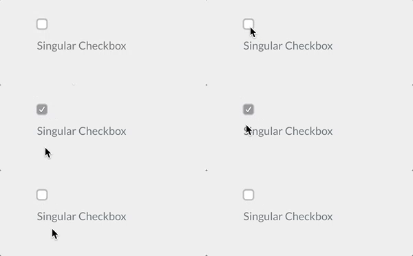
The checkbox field type is used to add a single checkbox to your form.
Example:
 1agree_to_terms:
 2  type: checkbox
 3  label: "Agree to the terms and conditions"
 4  validate:
 5      required: true
| Common Attributes Allowed |
|---|
| autofocus |
| classes |
| default |
| disabled |
| id |
| label |
| name |
| novalidate |
| outerclasses |
| size |
| style |
| validate.required |
| validate.pattern |
| validate.message |
Checkboxes Field

The checkboxes field type is used to add a group of checkboxes to your form.
Examples:
 1pages.process:
 2    type: checkboxes
 3    label: PLUGIN_ADMIN.PROCESS
 4    help: PLUGIN_ADMIN.PROCESS_HELP
 5    default:
 6        markdown: true
 7        twig: true
 8    options:
 9        markdown: Markdown
10        twig: Twig
11    use: keys
 1my_field:
 2    type: checkboxes
 3    label: A couple of checkboxes with help for each option and option1 disabled
 4    default:
 5        - option1
 6        - option2
 7    options:
 8        option1: Option 1
 9        option2: Option 2
10    help_options:
11        option1: Help for Option 1
12        option2: Help for Option 2
13    disabled_options:
14        - option1
| Attribute | Description |
|---|---|
use |
When set to keys, the checkbox will store the value of the element key when the form is submitted. Otherwise, it will use the element value. |
options |
An array of key-value options that will be allowed. |
help_options |
An array of key-value with help for each option defined in options. |
disabled_options |
A list of options that will be displayed disabled. |
markdown |
When true, the option labels are processed as markdown and may contain HTML. Otherwise they are escaped and rendered as text. |
| Common Attributes Allowed |
|---|
| autofocus |
| classes |
| default |
| disabled |
| help |
| id |
| label |
| name |
| outerclasses |
| size |
| style |
| validate.required |
| validate.pattern |
| validate.message |
Caution
NOTE: The checkboxes field does not support the remember process action.
Color Field
The color field type allows the user to select a color using a color picker. It is rendered as an HTML input of type color.
Examples:
 1background_color:
 2  type: color
 3  label: Background Color
 4  default: "#ffffff"
 5  classes: "color-picker"
| Attribute | Description |
|---|---|
default |
Sets the default color value |
Columns Field
The columns field type is used to group multiple fields into a multi-column layout.
Each columns field contains one or more column fields, which determine how content is arranged horizontally.
This field does not render inputs of its own. It simply organizes sub-fields into a structured, responsive layout.
Examples:
 1my_columns:
 2  type: columns
 3  fields:
 4    column1:
 5      type: column
 6      fields:
 7        header.title:
 8          type: text
 9          label: Title
10
11    column2:
12      type: column
13      fields:
14        header.subtitle:
15          type: text
16          label: Subtitle
| Attribute | Description |
|---|---|
fields |
Defines the list of column fields |
Column Field
The column field type represents a single column inside a columns field.
It wraps a set of fields inside a <div class="form-column"> container, allowing them to be displayed side by side.
This field does not accept input itself; it only groups and structures other fields.
Examples:
 1my_column:
 2  type: column
 3  classes: "one-half"
 4  fields:
 5    header.description:
 6      type: textarea
 7      label: Description
| Attribute | Description |
|---|---|
fields |
Defines the fields inside the column |
classes |
CSS classes applied to the column wrapper |
Conditional Field
The conditional field type is used to conditionally display some other fields base on a condition.
Examples:
If your conditional already returns a true or false then you can simply use this simplified format:
 1my_conditional:
 2  type: conditional
 3  condition: config.plugins.yourplugin.enabled
 4  fields: # The field(s) below will be displayed only if the plugin named yourplugin is enabled
 5    header.mytextfield:
 6      type: text
 7      label: A text field
However, if you require more complex conditions, you can perform some logic that returns 'true' or 'false' as strings, and the field will understand that too.
 1my_conditional:
 2  type: conditional
 3  condition: "config.site.something == 'custom'"
 4  fields: # The field(s) below will be displayed only if the `site` configuration option `something` equals `custom`
 5    header.mytextfield:
 6        type: text
 7        label: A text field
| Attribute | Description |
|---|---|
condition |
The condition evaluated by twig. Any variable accessible by twig can be evaluated |
Date Field
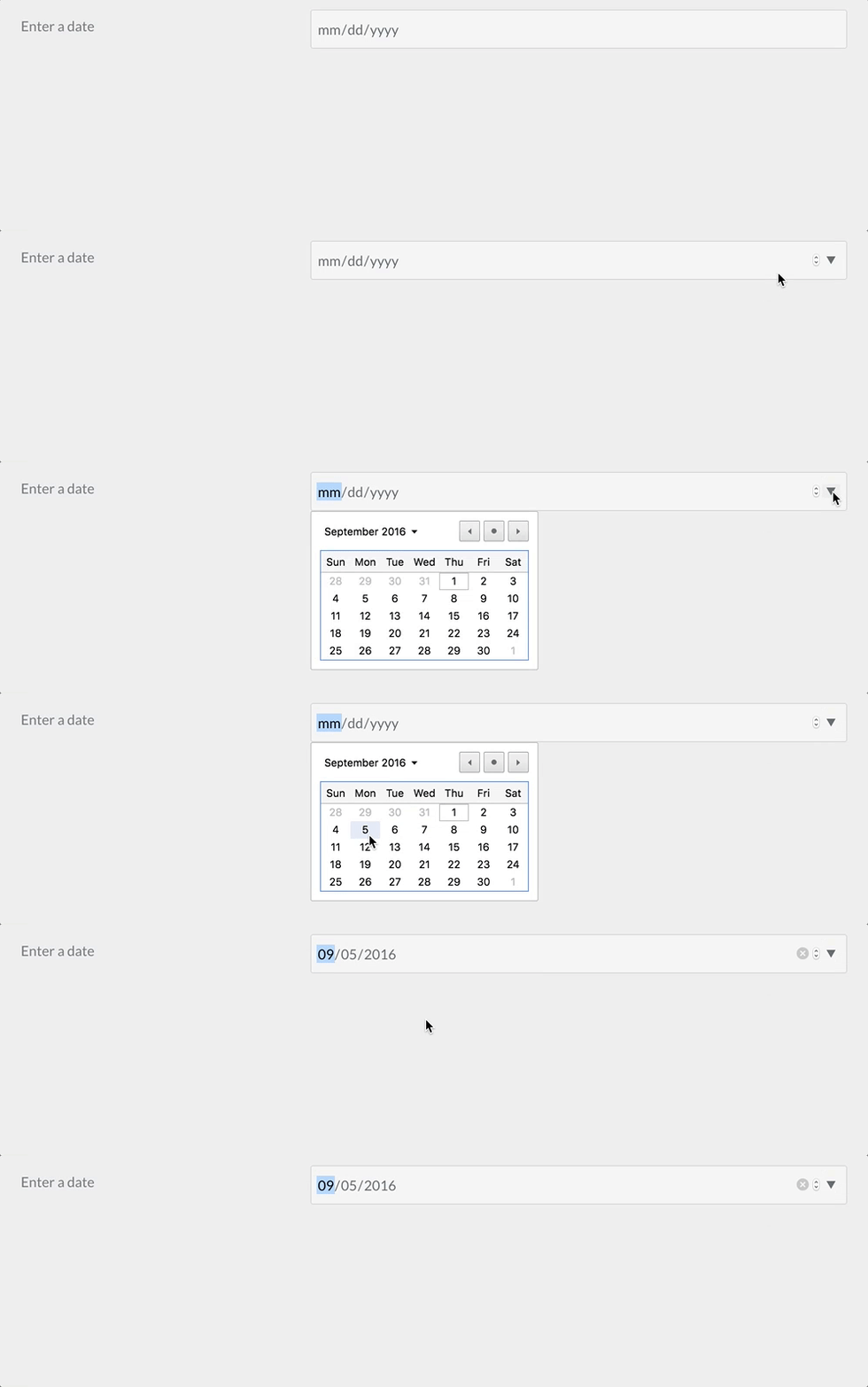
The date field type is used to add an HTML5 date input field.
Example:
 1-
 2  type: date
 3  label: Enter a date
 4  validate.min: "2014-01-01"
 5  validate.max: "2018-12-31"
| Attribute | Description |
|---|---|
validate.min |
Sets the min attribute of the field (see http://html5doctor.com/the-woes-of-date-input/#feature-min-max-attributes) |
validate.max |
Sets the max attribute of the field (see http://html5doctor.com/the-woes-of-date-input/#feature-min-max-attributes) |
| Common Attributes Allowed |
|---|
| autofocus |
| classes |
| default |
| disabled |
| help |
| id |
| label |
| name |
| novalidate |
| outerclasses |
| readonly |
| size |
| style |
| title |
| validate.required |
| validate.pattern |
| validate.message |
Display Field

The display field type is used to show some text or instructions inside the form. Can accept markdown content
Example:
 1test:
 2    type: display
 3    size: large
 4    label: Instructions
 5    markdown: true
 6    content: "This is a test of **bold** and _italic_ in a text/display field\n\nanother paragraph...."
| Attribute | Description |
|---|---|
markdown |
boolean value that enables markdown processing on the content field |
content |
the textual content to show |
Email Field

The email field type is used to present a text input field that accepts an email, using the email HTML5 input.
Caution
Emails are case-insensitive by design. Ensure that your application logic handles upper-, lower- or mixed case emails properly.
Example:
 1header.email:
 2  type: email
 3  autofocus: true
 4  label: Email
| Attribute | Description |
|---|---|
minlength |
minimum text length |
maxlength |
maximum text length |
validate.min |
same as minlength, either spelling works |
validate.max |
same as maxlength, either spelling works |
validate.trim |
strips leading and trailing whitespace from the value before the length is measured |
| Common Attributes Allowed |
|---|
| autofocus |
| classes |
| default |
| disabled |
| help |
| id |
| label |
| name |
| novalidate |
| outerclasses |
| readonly |
| size |
| style |
| title |
| validate.required |
| validate.pattern |
| validate.message |
Fieldset Field
The fieldset field type allows you to group multiple fields inside an HTML <fieldset> element.
It can optionally display a <legend> as the title of the field group.
This field does not store a value by itself — it simply organizes other fields visually and semantically.
Example:
 1user_info:
 2  type: fieldset
 3  id: user-info
 4  legend: User Information
 5  classes: "group-box"
 6  fields:
 7    name:
 8      type: text
 9      label: Name
10
11    email:
12      type: email
13      label: Email Address
| Attribute | Description |
|---|---|
legend |
The title displayed above the grouped fields |
fields |
The list of fields contained inside the fieldset |
id |
Sets the <fieldset> element ID |
classes |
Adds CSS classes to the <fieldset> |
File Field
With the file field type, you can let users upload files through the form. The field by default allows one file only, of type image and will get uploaded to the current page where the form has been declared.
 1# Default settings
 2my_files:
 3  type: file
 4  multiple: false
 5  destination: 'self@'
 6  accept:
 7    - image/*
| Attribute | Description |
|---|---|
multiple |
Can be true or false, when set to true, multiple files can be selected at the same time |
destination |
Can be either @self, @page:/route, local/rel/path/, or a PHP stream. Set to @self, the files will be uploaded where the form has been declared (current .md). Using @page:/route will upload to the specified route of a page, if exists (e.g., @page:/blog/a-blog-post). Set to 'local/rel/path': Can be any path relative to the Grav instance. For instance, user/images/uploads. If the path doesn't exist, it will get created, so make sure it is writable.You can also set the value to any valid PHP stream recognized by Grav like user-data://my-form or theme://media/uploads. |
accept |
Takes an array of MIME types that are allowed. For instance to allow only gifs and mp4 files: accept: ['image/gif', 'video/mp4'] |
Note
The File field in the admin is a bit different, allowing also to delete a file uploaded to a form, because the use-case in admin is to upload and then associate a file to a field.
| Common Attributes Allowed |
|---|
| help |
| label |
| name |
| outerclasses |
By default, in Admin the file field will overwrite an uploaded file that has the same name of a newer one, contained in the same folder you want to upload it, unless you set avoid_overwriting to true in the field definition.
FilePond Field
Added in Forms 7.0.0, the filepond field type is a modern alternative to the File field, powered by the FilePond JavaScript library. It provides a superior user experience with drag-and-drop uploads, image previews, built-in image editing (crop, resize, rotate), and smooth animations.
When to use FilePond:
- Image-heavy forms requiring preview and editing capabilities
- Modern user interfaces with drag-and-drop functionality
- Forms requiring client-side image optimization before upload
- Projects prioritizing user experience over legacy browser support
When to use File field (Dropzone):
- General file uploads (non-image files)
- Simpler implementation without image editing needs
- Legacy browser compatibility requirements
Basic Usage
 1my_images:
 2    type: filepond
 3    label: Upload Images
 4    destination: user/media/uploads
 5    multiple: true
 6    limit: 5
 7    filesize: 10
 8    accept:
 9        - image/*
Configuration Options
| Attribute | Description |
|---|---|
multiple |
Boolean. When true, allows multiple files to be selected simultaneously (default: false) |
limit |
Integer. Maximum number of files allowed per field (default: 10) |
destination |
Upload destination. Options: • @self - Upload to current page• @page:/route - Upload to specific page route• user/path/to/folder - Relative path from Grav root• PHP streams like user-data://uploads |
filesize |
Integer. Maximum file size in MB. 0 = unlimited, subject to server limits (default: 0) |
accept |
Array of MIME types/extensions allowed. Examples: • ['image/*'] - All images• ['image/jpeg', 'image/png'] - Specific types• ['application/pdf'] - PDFs |
avoid_overwriting |
Boolean. When true, adds date prefix to prevent file overwrite (default: false) |
random_name |
Boolean. When true, generates random filename on upload (default: false) |
validate.required |
Boolean. Makes the field required (default: false) |
Image Transform & Resize Options
FilePond includes powerful image processing capabilities through the filepond configuration key:
 1my_images:
 2    type: filepond
 3    label: Upload and Edit Images
 4    destination: user/media/uploads
 5    multiple: true
 6    filesize: 10
 7    accept:
 8        - image/jpeg
 9        - image/png
10        - image/webp
11    filepond:
12        # Output Format
13        allowImageTransform: true
14        imageTransformOutputMimeType: 'image/jpeg'
15        imageTransformOutputQuality: 85
16        imageTransformOutputStripImageHead: true
17
18        # Resize Settings
19        allowImageResize: true
20        imageResizeTargetWidth: 1024
21        imageResizeTargetHeight: 768
22        imageResizeMode: 'contain'
23        imageResizeUpscale: false
24
25        # Crop Settings
26        allowImageCrop: true
27        imageCropAspectRatio: '16:9'
28
29        # Preview Settings
30        allowImagePreview: true
31        imagePreviewHeight: 256
32
33        # UI Customization
34        stylePanelLayout: 'compact'
35        labelIdle: '<span class="filepond--label-action">Browse</span> or drop images'
FilePond-Specific Options Reference
| Option | Type | Default | Description |
|---|---|---|---|
| Image Transform | |||
allowImageTransform |
boolean | true |
Enable image transformation before upload |
imageTransformOutputMimeType |
string | image/jpeg |
Output format: image/jpeg, image/png, image/webp |
imageTransformOutputQuality |
int | 90 |
Output quality 0-100 (JPEG/WebP only) |
imageTransformOutputStripImageHead |
boolean | true |
Remove EXIF metadata from images |
| Image Resize | |||
allowImageResize |
boolean | true |
Enable automatic image resizing |
imageResizeTargetWidth |
int | null |
Target width in pixels (null = no resize) |
imageResizeTargetHeight |
int | null |
Target height in pixels (null = no resize) |
imageResizeMode |
string | cover |
Resize mode: cover (crop to fit), contain (fit within), force (exact size) |
imageResizeUpscale |
boolean | false |
Allow upscaling smaller images to target size |
| Image Crop | |||
allowImageCrop |
boolean | true |
Enable crop tool in preview |
imageCropAspectRatio |
string | null |
Aspect ratio like 16:9, 4:3, 1:1, or null for free crop |
| Preview | |||
allowImagePreview |
boolean | true |
Show image preview with editing tools |
imagePreviewHeight |
int | 256 |
Preview panel height in pixels |
| UI & Style | |||
stylePanelLayout |
string | compact |
Panel layout style |
styleLoadIndicatorPosition |
string | center bottom |
Loading indicator position |
styleProgressIndicatorPosition |
string | center bottom |
Progress bar position |
styleButtonRemoveItemPosition |
string | right |
Remove button position |
| Labels | |||
labelIdle |
string | Browse or drop files |
Main drop zone label (supports HTML) |
labelFileTypeNotAllowed |
string | Invalid file type |
Error message for wrong file type |
labelFileSizeNotAllowed |
string | File is too large |
Error message for oversized files |
Complete Form Example
 1---
 2title: 'Photo Upload Form'
 3form:
 4    id: photo-upload
 5    xhr_submit: true
 6    fields:
 7        photos:
 8            type: filepond
 9            label: Upload Your Photos
10            help: Upload up to 5 photos. They will be automatically resized to 1920x1080.
11            destination: user/media/galleries
12            multiple: true
13            limit: 5
14            filesize: 15
15            accept:
16                - image/jpeg
17                - image/png
18                - image/webp
19            validate:
20                required: true
21            filepond:
22                # Optimize images for web
23                imageTransformOutputMimeType: 'image/jpeg'
24                imageTransformOutputQuality: 85
25                imageTransformOutputStripImageHead: true
26
27                # Resize to HD
28                allowImageResize: true
29                imageResizeTargetWidth: 1920
30                imageResizeTargetHeight: 1080
31                imageResizeMode: 'contain'
32
33                # Force 16:9 crop
34                allowImageCrop: true
35                imageCropAspectRatio: '16:9'
36
37                # Custom label
38                labelIdle: '<span class="filepond--label-action">Click to browse</span> or drag photos here'
39
40    buttons:
41        submit:
42            type: submit
43            value: Upload Photos
44
45    process:
46        upload: true
47        message: 'Thank you! Your photos have been uploaded successfully.'
48        reset: true
49---
50
51# Photo Gallery Upload
52
53Upload your photos and they will be automatically optimized and resized.
Form Processing
The FilePond field requires the upload process action to save uploaded files:
 1process:
 2    upload: true
 3    message: 'Files uploaded successfully!'
Files are processed via AJAX and saved to the specified destination folder. Image transformations (resize, crop, format conversion) happen in the browser before upload, reducing server load and upload time.
XHR Form Integration
FilePond works seamlessly with AJAX form submissions (xhr_submit: true). The field automatically:
- Prevents form submission while files are uploading
- Reinitializes after form updates
- Preserves uploaded files during validation errors
- Cleans up temporary files on successful submission
Features Summary
✅ Modern drag-and-drop interface - Smooth animations and visual feedback ✅ Image preview - See images before upload with zoom and pan ✅ Built-in image editing - Crop, resize, rotate images in the browser ✅ Client-side optimization - Reduce file size before upload ✅ Format conversion - Convert images to JPEG/PNG/WebP ✅ Real-time validation - File type and size validation with instant feedback ✅ Progress indication - Upload progress bars for each file ✅ Multiple file support - Upload several files with one field ✅ Responsive design - Works on desktop, tablet, and mobile devices ✅ Accessibility - Keyboard navigation and screen reader support
Comparison with File Field
| Feature | FilePond | File (Dropzone) |
|---|---|---|
| Image Preview | ✅ With zoom/pan | ✅ Thumbnail only |
| Image Editing | ✅ Crop, resize, rotate | ❌ None |
| Image Optimization | ✅ Client-side | ❌ Server-side only |
| Format Conversion | ✅ JPEG/PNG/WebP | ❌ None |
| Drag & Drop | ✅ Modern UI | ✅ Classic UI |
| File Type Validation | ✅ Real-time | ✅ On upload |
| Multiple Files | ✅ Yes | ✅ Yes |
| XHR Form Support | ✅ Automatic | ✅ Requires config |
| Best For | Images & UX | General files |
| Common Attributes Allowed |
|---|
| help |
| label |
| name |
| outerclasses |
| validate |
Formname Field
The formname field type inserts a hidden input that stores the name of the current form.
It is used internally by forms to keep track of which form was submitted, especially when multiple forms exist on the same page.
This field does not accept user input and does not allow customization beyond what the Twig explicitly supports.
Note
The default form template already outputs this hidden input for you, so you rarely need to add a formname field by hand. It is only useful when you are building a custom form template that does not include it.
Example:
 1form_identifier:
 2  type: formname
The generated HTML:
1<input type="hidden" name="__form-name__" value="my-form-name" />
| Attribute | Description |
|---|---|
| (none) | This field has no configurable attributes |
| Common Attributes Allowed |
|---|
| (none — all common attributes are ignored) |
Hidden Field
The hidden field type is used to add a hidden element to a form.
Example:
 1header.some_field:
 2  type: hidden
 3  default: my-value
| Attribute | Description |
|---|---|
name |
The field name. If missing, the field name is got from the field definition element (in the example above: header.some_field) |
evaluate |
To make use of variables like page.title for the value, you have to set this to true |
| Common Attributes Allowed |
|---|
| default |
Honeypot Field
The honeypot field type creates a hidden field that, when filled out, will return with an error. This is a useful way to prevent bots from filling out and submitting a form.
Example:
 1fields:
 2    honeypot:
 3      type: honeypot
This is a simple text field which does not appear on the front end. Bots, which detect fields in the code and fill them out automatically, will likely fill the field out. The error prevents that form from being properly submitted. The error comes back next to the form element, rather than on the top in a message block.
A honeypot field is a popular alternative to captcha fields.
Ignore Field
The ignore field type can be used to remove unused fields when extending from another blueprint
Example:
 1header.process:
 2  type: ignore
 3content:
 4  type: ignore
Key Field
The key field type provides a text input that also exposes an observable attribute (data-key-observe) used internally by JavaScript to watch for changes in the field's value.
It works similarly to a standard text field but is designed specifically for use cases where the field's value must dynamically update other form elements.
If the value is an array, it will automatically be converted into a comma-separated string.
Important
The rendered input has no name attribute, so a key field never submits a value with the form. It exists purely to drive other fields through its data-key-observe attribute, and is mostly used for the key column of a list row.
Example:
 1my_key:
 2  type: key
 3  label: Identifier
 4  placeholder: Enter an internal key
Generated HTML (simplified):
 1<input type="text"
 2       value="myvalue"
 3       data-key-observe="data[header][my_key]"
 4       placeholder="Enter an internal key" />
| Attribute | Description |
|---|---|
placeholder |
Placeholder text shown when the field is empty |
autocomplete |
Accepts on or off |
autofocus |
Automatically focuses the field when the form loads |
classes |
Adds custom CSS classes to the input |
disabled |
Disables the field |
id |
Sets the HTML id attribute |
novalidate |
Disables native HTML validation |
readonly |
Makes the input read-only |
size |
Sets the input container size |
style |
Inline CSS styles |
tabindex |
Sets the tab order |
title |
Sets a tooltip or validation message |
validate.required |
Requires a value before submitting |
validate.pattern |
Regex validation pattern |
validate.message |
Message shown when validation fails |
| Common Attributes Allowed |
|---|
| autocomplete |
| autofocus |
| classes |
| disabled |
| help |
| id |
| label |
| display_label |
| labelclasses |
| sublabel |
| sublabelclasses |
| name |
| novalidate |
| outerclasses |
| wrapper_classes |
| placeholder |
| readonly |
| size |
| style |
| title |
| type |
| validate.required |
| validate.pattern |
| validate.message |
Month Field
The month field type allows users to select a month and year. It stores the value in YYYY-MM format. To display it as a readable date, you can append -01 to create a full date (YYYY-MM-DD) and format it with Twig's date filter.
Examples:
 1header.billing_month:
 2type: month
 3label: Billing Month
 4placeholder: Select month
 5default: 2025-11
Display in Twig:
 1{% if page.header.billing_month %}
 2{% set month_value = page.header.billing_month ~ '-01' %} <p>{{ month_value|date("F Y") }}</p>
 3{% endif %}
This will render 2025-11 as November 2025 on the site.
| Attribute | Description |
|---|---|
| type | Defines the field type as month |
| label | The label displayed above the field |
| placeholder | Optional text displayed when no value is selected |
| default | Optional default value in YYYY-MM format |
Number Field
The number field type is used to present a text input field that accepts numbers only, using the number HTML5 input.
Example:
 1header.count:
 2  type: number
 3  label: 'How Much?'
 4  validate:
 5    min: 10
 6    max: 360
 7    step: 10
| Attribute | Description |
|---|---|
validate.min |
minimum value |
validate.max |
maximum value |
validate.step |
which increments to step up |
| Common Attributes Allowed |
|---|
| autofocus |
| classes |
| default |
| disabled |
| help |
| id |
| label |
| name |
| novalidate |
| outerclasses |
| readonly |
| size |
| style |
| title |
| validate.required |
| validate.pattern |
| validate.message |
Password Field
The password field type is used to present a password text input field.
Example:
 1password:
 2  type: password
 3  label: Password
| Common Attributes Allowed |
|---|
| autofocus |
| classes |
| default |
| disabled |
| help |
| id |
| label |
| name |
| novalidate |
| outerclasses |
| readonly |
| size |
| style |
| title |
| validate.required |
| validate.pattern |
| validate.message |
Radio Field

The radio field type is used to present a set of radio fields
Example:
 1my_choice:
 2  type: radio
 3  label: Choice
 4  default: markdown
 5  options:
 6      markdown: Markdown
 7      twig: Twig
| Attribute | Description |
|---|---|
options |
An array of key-value options that will be allowed. |
markdown |
When true, the option labels are processed as markdown and may contain HTML. Otherwise they are escaped and rendered as text. |
| Common Attributes Allowed |
|---|
| default |
| disabled |
| help |
| id |
| label |
| name |
| outerclasses |
| validate.required |
| validate.pattern |
| validate.message |
Range Field
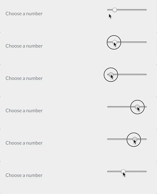
The range field is used to present a range input field.
Example:
 1header.choose_a_number_in_range:
 2  type: range
 3  label: Choose a number
 4  validate:
 5    min: 1
 6    max: 10
| Common Attributes Allowed |
|---|
| autofocus |
| classes |
| default |
| disabled |
| help |
| id |
| label |
| name |
| novalidate |
| outerclasses |
| readonly |
| size |
| style |
| title |
| validate.required |
| validate.pattern |
| validate.message |
Section Field
The Section field type is used to divide a setting page into sections.
Example:
 1content:
 2    type: section
 3    title: PLUGIN_ADMIN.DEFAULTS
 4    underline: true
 5
 6    fields:
 7
 8        #..... subfields
| Attribute | Description |
|---|---|
title |
A heading title |
text |
A text to show beneath |
security |
An array of credentials a user needs to visualize this section |
title_level |
Set a custom headline tag. Default: h3 |
Select Field
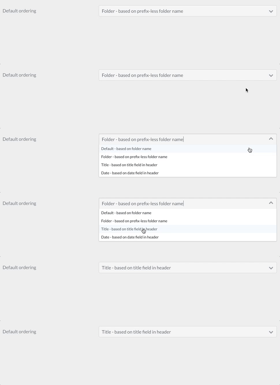
The select field type is used to present a select field.
Example 1:
 1pages.order.by:
 2    type: select
 3    size: long
 4    classes: fancy
 5    label: 'Default Ordering'
 6    help: 'Pages in a list will render using this order unless it is overridden'
 7    options:
 8        default: 'Default - based on folder name'
 9        folder: 'Folder - based on prefix-less folder name'
10        title: 'Title - based on title field in header'
11        date: 'Date - based on date field in header'
Example 2 - Disabling Individual Options:
 1my_element:
 2    type: select
 3    size: long
 4    classes: fancy
 5    label: 'My Select Element'
 6    help: 'Use the disabled key:value to display but disable a particular option'
 7    options:
 8        option1:
 9          value: 'Option 1'
10        option2:
11          value: 'Option 2'
12        option3:
13          disabled: true
14          value: 'Option 3'
| Attribute | Description |
|---|---|
options |
An array of key-value options that will be allowed. The key will be submitted by the form. |
multiple |
Allow the form to accept multiple values. |
If you set multiple to true, you need to add
pages.order.by:
  validate:
    type: array
Otherwise the array of selected values will not be saved correctly.
| Common Attributes Allowed |
|---|
| autofocus |
| classes |
| default |
| disabled |
| help |
| id |
| label |
| name |
| novalidate |
| outerclasses |
| size |
| style |
| validate.required |
| validate.pattern |
| validate.message |
Select Optgroup Field
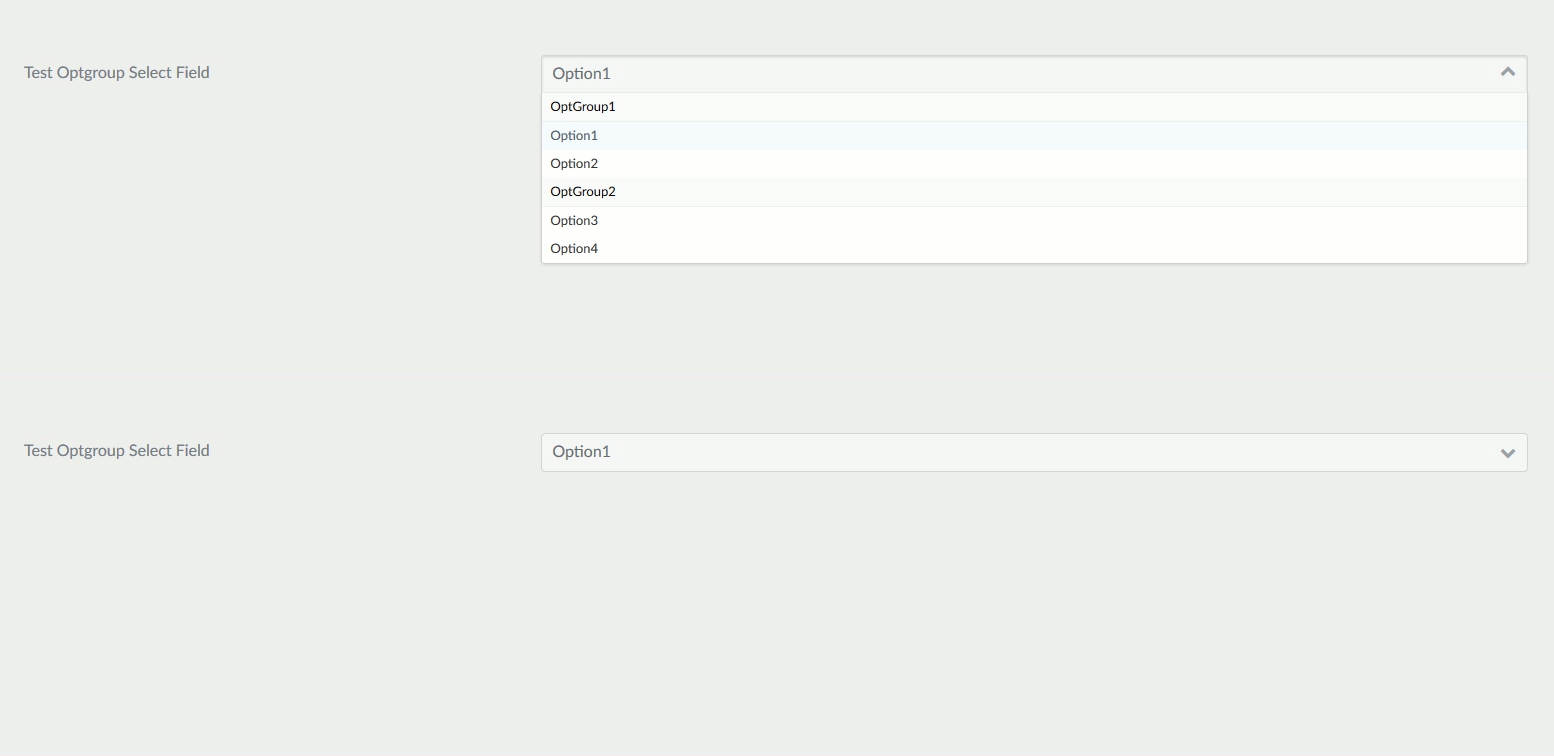
The select_optgroup field type is used to present a select field with groupings.
Example:
 1header.newField:
 2    type: select_optgroup
 3    label: Test Optgroup Select Field
 4    options:
 5      - OptGroup1:
 6        - Option1
 7        - Option2
 8      - OptGroup2:
 9        - Option3
10        - Option4
| Attribute | Description |
|---|---|
options |
An array of key-value options that will be allowed. |
multiple |
Allow the form to accept multiple values. |
| Common Attributes Allowed |
|---|
| autofocus |
| classes |
| default |
| disabled |
| help |
| id |
| label |
| name |
| novalidate |
| outerclasses |
| size |
| style |
| validate.required |
| validate.pattern |
| validate.message |
Spacer Field
The spacer field type is used to add some text, a headline or a hr tag
Example:
 1test:
 2    type: spacer
 3    title: A title
 4    title_type: h2
 5    text: Some text
 6    underline: true
| Attribute | Description |
|---|---|
title |
add a title to the form |
title_type |
Define the HTML tag for the title (e.g., h1, h2, h3, etc.). Defaults to h3 if not specified. |
text |
Add some text. If title is set, add it after the title |
underline |
boolean, add a <hr> tag if positive |
Switch Field
The switch field type provides an ON/OFF toggle using the same logic as a checkbox.
It is functionally identical to a checkbox but offers clearer semantics and a modern toggle-style UI.
Example
 1header.enable_feature:
 2  type: switch
 3  label: Enable Feature
 4  default: 1
 5  highlight: 1
 6  options:
 7    1: Enabled
 8    0: Disabled
This creates an ON/OFF switch where:
1= ON0= OFF
Specific Attributes
| Attribute | Description |
|---|---|
| type | Defines the field type as switch |
| default | Initial value (1 or 0) |
| highlight | Pre-selected value highlighted in the admin UI |
| options | Text labels for ON/OFF values |
Common Attributes Allowed
The Switch field supports all the same common attributes as Checkbox, including validation:
| Common Attributes Allowed |
|---|
| autofocus |
| classes |
| default |
| disabled |
| id |
| label |
| name |
| novalidate |
| outerclasses |
| size |
| style |
| validate.required |
| validate.pattern |
| validate.message |
Tabs / Tab Fields

The tabs and tab field types are used to divide the contained form fields in tabs.
Example:
 1tabs:
 2  type: tabs
 3  active: 1
 4
 5  fields:
 6    content:
 7      type: tab
 8      title: PLUGIN_ADMIN.CONTENT
 9
10      fields:
11
12        # .... other subfields
13
14    options:
15      type: tab
16      title: PLUGIN_ADMIN.OPTIONS
17
18      fields:
19
20        # .... other subfields
| Attribute | Description |
|---|---|
active |
The active tab number |
Tel Field
The tel field type is used to present a text input field that accepts a number, using the tel HTML5 input.
Example:
 1header.phone:
 2  type: tel
 3  label: 'Your Phone Number'
| Attribute | Description |
|---|---|
minlength |
minimum text length |
maxlength |
maximum text length |
validate.min |
same as minlength, either spelling works |
validate.max |
same as maxlength, either spelling works |
validate.trim |
strips leading and trailing whitespace from the value before the length is measured |
| Common Attributes Allowed |
|---|
| autofocus |
| classes |
| default |
| disabled |
| help |
| id |
| label |
| name |
| novalidate |
| outerclasses |
| readonly |
| size |
| style |
| title |
| validate.required |
| validate.pattern |
| validate.message |
Text Field

The text field is used to present a text input field.
Example:
 1header.title:
 2  type: text
 3  autofocus: true
 4  label: PLUGIN_ADMIN.TITLE
 5  minlength: 10
 6  maxlength: 255
| Attribute | Description |
|---|---|
prepend |
prepend some text or HTML to the front of a field |
append |
append some text or HTML to the end of a field |
minlength |
minimum text length |
maxlength |
maximum text length |
validate.min |
same as minlength, either spelling works |
validate.max |
same as maxlength, either spelling works |
validate.trim |
strips leading and trailing whitespace from the value before the length is measured |
| Common Attributes Allowed |
|---|
| autofocus |
| classes |
| default |
| disabled |
| help |
| id |
| label |
| name |
| novalidate |
| outerclasses |
| readonly |
| size |
| style |
| title |
| validate.required |
| validate.pattern |
| validate.message |
Textarea Field

The textarea field is used to present a textarea input field.
Example:
 1header.content:
 2  type: textarea
 3  autofocus: true
 4  label: PLUGIN_ADMIN.CONTENT
 5  minlength: 10
 6  maxlength: 255
| Attribute | Description |
|---|---|
rows |
Add a rows attribute with the value associated with this property |
cols |
Add a cols attribute with the value associated with this property |
minlength |
minimum text length |
maxlength |
maximum text length |
validate.min |
same as minlength, either spelling works |
validate.max |
same as maxlength, either spelling works |
validate.trim |
strips leading and trailing whitespace from the value before the length is measured |
| Common Attributes Allowed |
|---|
| autofocus |
| classes |
| default |
| disabled |
| help |
| id |
| label |
| name |
| novalidate |
| outerclasses |
| readonly |
| size |
| style |
| title |
| validate.required |
| validate.pattern |
| validate.message |
Time Field
The time field type allows users to select a time using the native HTML5 <input type="time"> element.
This field is ideal for events, scheduling, or any scenario requiring a HH:MM time format.
This template is used when the value is displayed in list or summary views (such as in the Admin panel), formatting the time as 3:45 PM instead of 15:45.
Example
 1header.event_time:
 2  type: time
 3  label: Event Time
 4  default: "14:30"
 5  placeholder: "HH:MM"
 6  help: "Select the event time"
 7  step: 60   # Minute interval (optional)
 8  validate:
 9    required: true
Specific Attributes
| Attribute | Description |
|---|---|
| type | Defines the field type as time |
| default | Initial value in HH:MM format |
| placeholder | Suggestive text shown when empty |
| step | Time interval in seconds (e.g. 60 = 1 minute) |
Common Attributes Allowed
The Time field supports the same common attributes as the Checkbox field:
| Common Attributes Allowed |
|---|
| autofocus |
| classes |
| default |
| disabled |
| id |
| label |
| name |
| novalidate |
| outerclasses |
| size |
| style |
| validate.required |
| validate.pattern |
| validate.message |
Toggle Field

The toggle field type is an on/off kind of input, with configurable labels.
Example:
 1summary.enabled:
 2    type: toggle
 3    label: PLUGIN_ADMIN.ENABLED
 4    highlight: 1
 5    help: PLUGIN_ADMIN.ENABLED_HELP
 6    options:
 7        1: PLUGIN_ADMIN.YES
 8        0: PLUGIN_ADMIN.NO
 9    validate:
10        type: bool
| Attribute | Description |
|---|---|
highlight |
The key of the option to highlight (set green when selected) |
options |
The list of key-value options |
markdown |
When true, the option labels are processed as markdown and may contain HTML. Otherwise they are escaped and rendered as text. |
| Common Attributes Allowed |
|---|
| default |
| help |
| label |
| name |
| style |
| toggleable |
| validate.required |
| validate.type |
| disabled |
Unique Id Field
The uniqueid field type generates a unique identifier for a form.
It is rendered as a hidden input and is primarily used internally to differentiate form submissions.
Note
The default form template already outputs this hidden input for you, so you rarely need to add a uniqueid field by hand. It is only useful when you are building a custom form template that does not include it.
Example
 1header.unique_form_id:
 2  type: uniqueid
Note
You generally do not need to set a label or default value for this field; it is automatically generated and hidden.
Specific Attributes
| Attribute | Description |
|---|---|
| type | Defines the field type as uniqueid |
| name | The input field name (default is __unique_form_id__) |
| value | Automatically generated unique value |
Common Attributes Allowed
Since this is a hidden/internal field, common attributes are minimal:
| Common Attributes Allowed |
|---|
| id |
| name |
| classes |
| disabled |
| outerclasses |
| style |
Url Field
The url field type is used to present a text input field that accepts an URL, using the url HTML5 input.
Example:
 1header.url:
 2  type: url
 3  label: 'Your Website Url'
| Attribute | Description |
|---|---|
minlength |
minimum text length |
maxlength |
maximum text length |
validate.min |
same as minlength, either spelling works |
validate.max |
same as maxlength, either spelling works |
validate.trim |
strips leading and trailing whitespace from the value before the length is measured |
| Common Attributes Allowed |
|---|
| autofocus |
| classes |
| default |
| disabled |
| help |
| id |
| label |
| name |
| novalidate |
| outerclasses |
| readonly |
| size |
| style |
| title |
| validate.required |
| validate.pattern |
| validate.message |
Value Field
The value field type is used to display a non-editable value within a form.
It does not render an input for the user to type; instead, it outputs a value according to optional formatting rules.
Example
 1header.display_name:
 2  type: value
 3  label: Display Name
 4  default: "Guest"
 5  filter: raw
Optional example using date:
 1header.submission_date:
 2  type: value
 3  label: Submitted On
 4  default: "2025-11-25"
 5  filter: date
Specific Attributes
| Attribute | Description |
|---|---|
| type | Defines the field type as value |
| default | Default value to display if none is provided |
| options | Optional mapping of stored values to display labels |
| filter | Optional formatting filter: 'date', 'raw', or default plain text |
Common Attributes Allowed
| Common Attributes Allowed |
|---|
| id |
| classes |
| label |
| name |
| style |
| outerclasses |
Week Field
The week field type allows users to select a week number within a specific year.
It is rendered as an HTML <input type="week">, enabling browsers that support it to display a week picker.
Example
 1header.billing_week:
 2  type: week
 3  label: Billing Week
 4  placeholder: "Select week"
 5  default: "2025-W48"
Human-readable output (showing the first day of the week):
 1{% if page.header.billing_week %}
 2    {# Append '-1' to get the Monday of the week #}
 3    {% set week_start = page.header.billing_week ~ '-1' %}
 4    <p>Week starts on: {{ week_start|date("F j, Y") }}</p>
 5{% endif %}
Example: If
billing_weekis2025-W48, the output will beWeek starts on: November 24, 2025.
Specific Attributes
| Attribute | Description |
|---|---|
| type | Defines the field type as week |
| default | Optional default value in YYYY-Www format |
| placeholder | Optional text shown when the field is empty |
Common Attributes Allowed
| Common Attributes Allowed |
|---|
| autofocus |
| classes |
| default |
| disabled |
| id |
| label |
| name |
| novalidate |
| outerclasses |
| size |
| style |
| validate.required |
| validate.pattern |
| validate.message |
Currently Undocumented Fields
| Field | Description |
|---|---|
| Datetime | |
| Signature |