

Reference: Blueprint Form Fields
Available Form Fields for Use in the Admin
Admin-side forms can be created with a variety of fields. This document provides a complete reference of the properties of each field, and provides usage examples.
In addition to the fields listed below, you can also use all the fields available in the frontend forms described in the Frontend Forms Fields Reference.
Note
This reference carries over from the Grav 1.7 documentation and describes fields as they behave in both admins, except where a field is marked otherwise. The Media field is new in Grav 2.0 and renders in Admin Next only.
Special Form Fields Available in the Admin
Note
Most of the fields in this table are Admin-only, but a few of them are also provided by the Form plugin for frontend forms: Array, Columns, Column, Datetime, Fieldset, File, Range and Section. The Admin ships its own version of these, so the attributes documented here apply to Admin forms. For their frontend behaviour, see the Frontend Forms Fields Reference.
| Field | Description | |
|---|---|---|
| Array | used to create key-value arrays | |
| BackupHistory | ||
| Blueprint | ||
| Colorpicker | show a color picker | |
| Columns | used to break the form into multiple columns | |
| Column | used to show a single column (used with the Columns field) |
|
| Cron | ||
| CronStatus | ||
| Dateformat | a special select that renders the current date/time in the passed formats | |
| Datetime | a date and time selection field | |
| Editor | show a markdown editor | |
| Elements | a conditional, and organizational, field to show/hide children based on the selected value of the "trigger". This is extremely useful to keep the clutter down when there are a lot of options to display | |
| Fieldset | group a set of fields inside a collapsible accordion | |
| File | in Admin, File is specialized to be used in plugin and theme configurations (blueprints). Handles uploading a file to a location and deleting it, and removing it from the theme / plugin configuration | |
| Filepicker | Filepicker allows to choose files from a location in the web server filesystem. | |
| Frontmatter | a plain YAML-mode code editor whose content is stored as a raw string under the field's own name | |
| IconPicker | pick a Font Awesome icon from a visual picker. The selected icon is stored as its class name | |
| List | used to create collections of fields | |
| Markdown | a Markdown editor with a formatting toolbar and preview, the same one the page's Content field uses | |
| Media | pick an image or file from the page's own media, the site media library, or an external URL. Grav 2.0 and Admin Next only | |
| MediaPicker | ||
| Multilevel | ||
| Order | ||
| PageMedia | ||
| PageMediaSelect | an alias of Filepicker, named for use in Pages blueprints: shows a select with all the page media so the user can assign one to a field | |
| Pages | shows a list of the site pages | |
| Parents | a page picker for selecting the parent page of a page, showing the site's page hierarchy | |
| Permissions | ||
| Range | ||
| Section | used to divide a setting page into sections; each section comes with a title | |
| Selectize | a hybrid of a text box and a select box. Mostly useful for tagging and other element picking fields. | |
| SelectUnique | ||
| Taxonomy | a special select preconfigured to select one or more taxonomies | |
| ThemeSelect | ||
| UserInfo | ||
| Xss |
Common Fields Attributes
Every field accepts a list of attributes you can use. Each field could share these common attributes, but particular fields might ignore them. The best way to check which attributes are allowed on a field is to check the field description in this page, and see which attributes are mentioned.
This list provides a common ground so there's no need to repeat the description of a common field.
| Attribute | Description |
|---|---|
autocomplete |
accepts on or off |
autofocus |
if enabled, autofocus on that field |
classes |
accepts a string with one or more CSS classes to add |
default |
sets the field default value. This ensures you will always get back either a user-specified value or this default value. See also placeholder. |
disabled |
sets the field disabled state |
help |
Adds a tooltip to the field |
id |
sets the field id as well as the for attribute on the label |
label |
sets the field label |
name |
sets the field name |
novalidate |
sets the field novalidate state |
placeholder |
sets the field placeholder value. This is to set a value the user can see as a prompt for their own value, but it does not influence what value ultimately gets written. See also default. |
readonly |
sets the field read-only state |
size |
sets the field size, which in turn adds a class to its container. Valid values are large, x-small, medium, long, small. You can of course add more in the template you see, when used in the frontend |
style |
sets the field style. If set to vertical, the field is able to appear full width. This is an easy way to clean up the form. |
title |
sets the field title value |
toggleable |
add a checkbox that will toggle the enabled/disabled attribute of the field |
validate.required |
if set to a positive value, sets the field as required |
validate.pattern |
sets a validation pattern |
validate.message |
sets the message shown if the validation fails |
validate.type |
sets the field type used during validation |
Know more about fields
You can read how the fields are built from the source: Fields added by the Form Plugin and the field components Admin Next renders.
Validation
Most of the fields allow validation.
 1validate:
 2    required: true
will cause the field to be marked as required.
 1validate:
 2    message: 'Some message'
will show the defined message when the field is not correctly filled.
 1validate:
 2    pattern: 'Some pattern'
will validate the field value against the passed regex pattern. Examples: pattern: "[1-9][0-9]*", pattern: '[A-Za-z0-9-]+', pattern: '[a-z0-9-]+', pattern: '^[a-z0-9_-]{3,16}$', pattern: '(?=.*\d)(?=.*[a-z])(?=.*[A-Z]).{8,}'
validate.type
validate.type indicates which type should it validate against.
Some examples:
An editor will result in a textarea:
 1content:
 2    type: editor
 3    validate:
 4      type: textarea
A selectize will be a commalist:
 1taxonomies:
 2    type: selectize
 3    size: large
 4    label: PLUGIN_ADMIN.TAXONOMY_TYPES
 5    classes: fancy
 6    help: PLUGIN_ADMIN.TAXONOMY_TYPES_HELP
 7    validate:
 8        type: commalist
 9
10filters.category:
11  type: selectize
12  label: Category filter
13  help: Comma separated list of category names
14  validate:
15    type: commalist
Validate an email address:
 1author.email:
 2    type: text
 3    size: large
 4    label: PLUGIN_ADMIN.DEFAULT_EMAIL
 5    help: PLUGIN_ADMIN.DEFAULT_EMAIL_HELP
 6    validate:
 7        type: email
Make sure a value is a bool:
 1summary.enabled:
 2    type: toggle
 3    label: PLUGIN_ADMIN.ENABLED
 4    highlight: 1
 5    help: PLUGIN_ADMIN.ENABLED_HELP
 6    options:
 7        1: PLUGIN_ADMIN.YES
 8        0: PLUGIN_ADMIN.NO
 9    validate:
10        type: bool
Make sure a value is an integer between 0 and 65536:
 1summary.size:
 2    type: text
 3    size: x-small
 4    label: PLUGIN_ADMIN.SUMMARY_SIZE
 5    help: PLUGIN_ADMIN.SUMMARY_SIZE_HELP
 6    validate:
 7        type: int
 8        min: 0
 9        max: 65536
Make sure a value is a number > 1:
 1pages.list.count:
 2    type: text
 3    size: x-small
 4    label: PLUGIN_ADMIN.DEFAULT_PAGE_COUNT
 5    help: PLUGIN_ADMIN.DEFAULT_PAGE_COUNT_HELP
 6    validate:
 7        type: number
 8        min: 1
Validate a taxonomy type as an array:
 1header.taxonomy:
 2  type: taxonomy
 3  label: PLUGIN_ADMIN.TAXONOMY
 4  multiple: true
 5  validate:
 6    type: array
Validate a text field as a slug:
 1folder:
 2  type: text
 3  label: PLUGIN_ADMIN.FOLDER_NAME
 4  validate:
 5    type: slug
Array Field
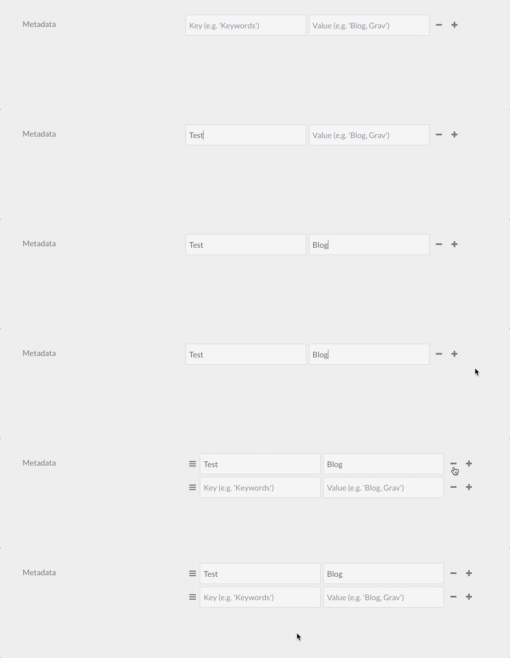
The array field type is used to create a simple list of key - values objects, or just a list of values if you use the value_only option.
Example:
 1metadata:
 2   type: array
 3   label: PLUGIN_ADMIN.METADATA
 4   help: PLUGIN_ADMIN.METADATA_HELP
 5   placeholder_key: PLUGIN_ADMIN.METADATA_KEY
 6   placeholder_value: PLUGIN_ADMIN.METADATA_VALUE
 7   required: true
| Attribute | Description |
|---|---|
placeholder_key |
|
placeholder_value |
|
value_only |
Do not require or store array keys, just store a simple array of values. |
value_type |
Set to textarea to display a textarea field for entering array values rather than the smaller text field. |
| Common Attributes Allowed |
|---|
| default |
| help |
| label |
| name |
| style |
| toggleable |
| validate.required |
| validate.type |
Colorpicker Field
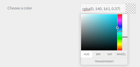
The colorpicker field type is used to display a color picker field
Example:
 1color:
 2   type: colorpicker
 3   label: Choose a color
 4   default: '#FFFFFF'
| Common Attributes Allowed |
|---|
| autocomplete |
| autofocus |
| classes |
| default |
| disabled |
| help |
| id |
| label |
| name |
| placeholder |
| style |
| title |
| toggleable |
| validate.message |
| validate.required |
| validate.type |
Columns / column Fields
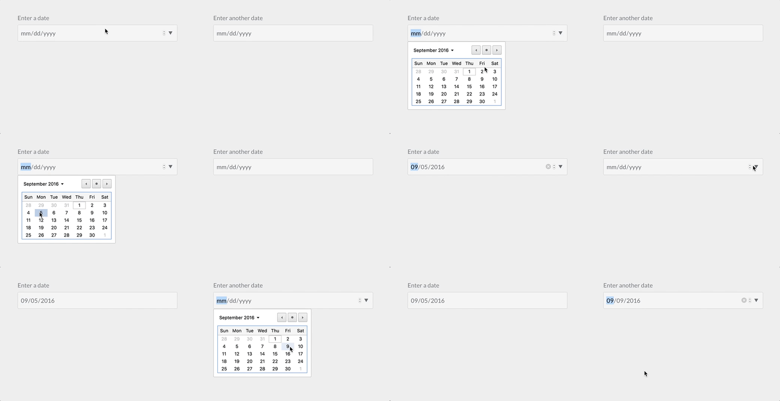
The columns and column field types are used to divide the contained form fields in columns
Example:
 1columns:
 2  type: columns
 3  fields:
 4    column1:
 5      type: column
 6      fields:
 7
 8        # .... subfields
 9
10    column2:
11      type: column
12      fields:
13
14        # .... other subfields
| Attribute | Description |
|---|---|
fields |
The columns / column subfields |
Dateformat Field

The dateformat field type is used to
Example:
 1pages.dateformat.short:
 2    type: dateformat
 3    size: medium
 4    classes: fancy
 5    label: PLUGIN_ADMIN.SHORT_DATE_FORMAT
 6    help: PLUGIN_ADMIN.SHORT_DATE_FORMAT_HELP
 7    default: "jS M Y"
 8    options:
 9        "F jS \\a\\t g:ia": Date1
10        "l jS \\of F g:i A": Date2
11        "D, d M Y G:i:s": Date3
12        "d-m-y G:i": Date4
13        "jS M Y": Date5
| Attribute | Description |
|---|---|
options |
The field available key-value options |
multiple |
boolean. If positive, the field accepts multiple values |
selectize |
| Common Attributes Allowed |
|---|
| autofocus |
| classes |
| default |
| disabled |
| help |
| label |
| name |
| novalidate |
| size |
| style |
| toggleable |
| validate.required |
| validate.type |
Datetime Field
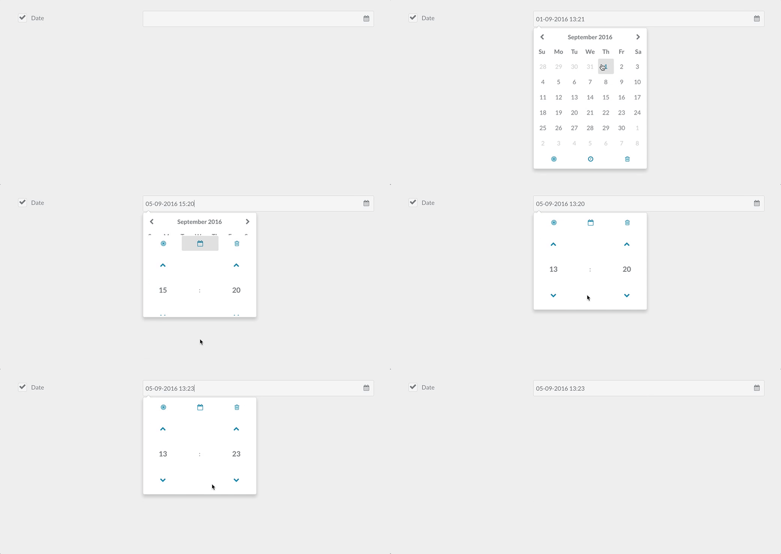
The datetime field type is used to store and present a date and time field.
Example:
 1header.date:
 2  type: datetime
 3  label: PLUGIN_ADMIN.DATE
 4  toggleable: true
 5  help: PLUGIN_ADMIN.DATE_HELP
| Attribute | Description |
|---|---|
format |
A datetime format value, you may use any of the PHP datetime formats avaliable. |
validate.min |
A minimum valid value |
validate.max |
A maximum valid value |
| Common Attributes Allowed |
|---|
| default |
| help |
| label |
| name |
| size |
| style |
| toggleable |
| validate.required |
| validate.type |
Editor Field
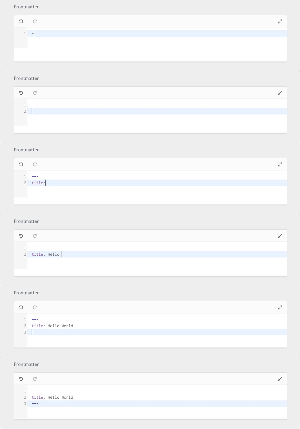
The editor field type is used to present the Codemirror editor
Example:
 1frontmatter:
 2  classes: frontmatter
 3  type: editor
 4  label: PLUGIN_ADMIN.FRONTMATTER
 5  autofocus: true
 6  codemirror:
 7    mode: 'yaml'
 8    indentUnit: 4
 9    autofocus: true
10    indentWithTabs: false
11    lineNumbers: true
12    styleActiveLine: true
13    gutters: ['CodeMirror-lint-markers']
14    lint: true
| Attribute | Description |
|---|---|
codemirror |
A set of values to be set on the codemirror editor. By default uses mode: gfm (github flavored markdown) |
resizer |
If positive, enables the resizer. Otherwise the editor is fixed |
| Common Attributes Allowed |
|---|
| default |
| help |
| label |
| name |
| style |
| validate.required |
| validate.type |
| autofocus |
| classes |
| disabled |
| id |
| novalidate |
| placeholder |
| readonly |
Elements Field
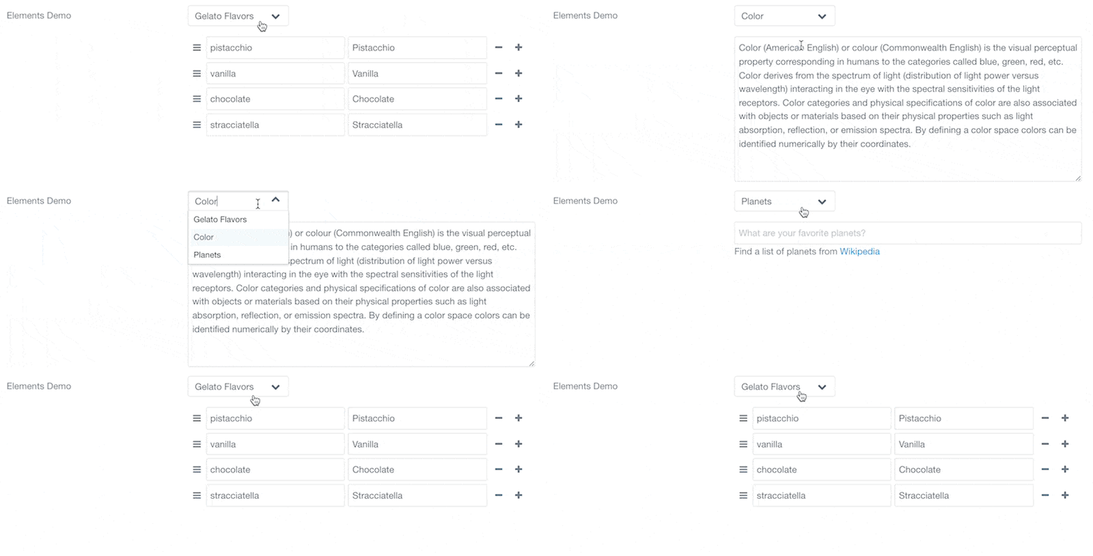
This field is only organizational and allows grouping items within a named group that will only be showed if the selected element value matches the group.
Example:
 1header.elements-demo.type:
 2  type: elements
 3  label: 'Elements Demo'
 4  size: small
 5  default: gelato
 6  options:
 7    gelato: Gelato Flavors
 8    color: Color
 9    planets: Planets
10  fields:
11    gelato:
12      type: element
13      fields:
14        .flavours:
15          type: array
16          default:
17            pistacchio: Pistacchio
18            vanilla: Vanilla
19            chocolate: Chocolate
20            stracciatella: Stracciatella
21    color:
22      type: element
23      fields:
24        .description:
25          type: textarea
26          rows: 10
27          default: Color (American English) or colour (Commonwealth English) is the visual perceptual property corresponding in humans to the categories called blue, green, red, etc. Color derives from the spectrum of light (distribution of light power versus wavelength) interacting in the eye with the spectral sensitivities of the light receptors. Color categories and physical specifications of color are also associated with objects or materials based on their physical properties such as light absorption, reflection, or emission spectra. By defining a color space colors can be identified numerically by their coordinates.
28    planets:
29      type: element
30      fields:
31        .favorites:
32          type: text
33          placeholder: What are your favorite planets?
34          markdown: true
35          description: 'Find a list of planets from [Wikipedia](https://en.wikipedia.org/wiki/Planet)'
Fieldset Field
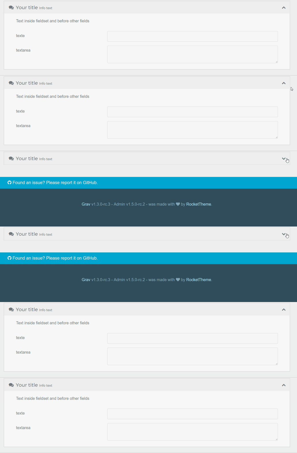 The
The fieldset groups a set of fields inside a collapsible box.
Example:
 1header.fieldset:
 2  type: fieldset
 3  title: Your title
 4  help: Help text
 5  info: Info text
 6  text: Text inside fieldset and before other fields
 7  icon: comments       # Fork Awesome icons system (see : forkaweso.me).
 8  collapsed: true      # Initial state of fieldset (see collapsible option)
 9  collapsible: true    # Whether one can expand the fieldset or not
10  fields:
11    header.fieldset.an_example_text:
12      type: text
13      label: text
14    header.fieldset.an_example_textarea:
15      type: textarea
16      label: textarea
!Fieldsets have to be saved in the frontmatter too, with header., in order for their sub-field states to be correctly remembered!
Caution
Known issue : if fields in a fieldset use a toggleable:, their state won't be memorized if the fieldset named isn't prefixed with header.. Here's an example of a valid structure with a modification of the pagination option :
 1header.fieldset:
 2  type: fieldset
 3  ... etc...
 4  fields:
 5    header.content.pagination:
 6      type: toggle
 7      toggleable: true
 8      label: "Activate Pagination ?"
 9      highlight: 1
10      default: 0
11      options:
12        1: Yes
13        0: No
14      validate:
15        type: bool
Icon of the fieldset
You can use an icon to place in the header of the fieldset. The icon system used is Fork Awesome.
| Attribute | Description |
|---|---|
icon |
An icon for the box |
collapsed |
If true, the list is opened collapsed. By default it's expanded |
collapsible |
Whether one can expand the fieldset or not |
File Field
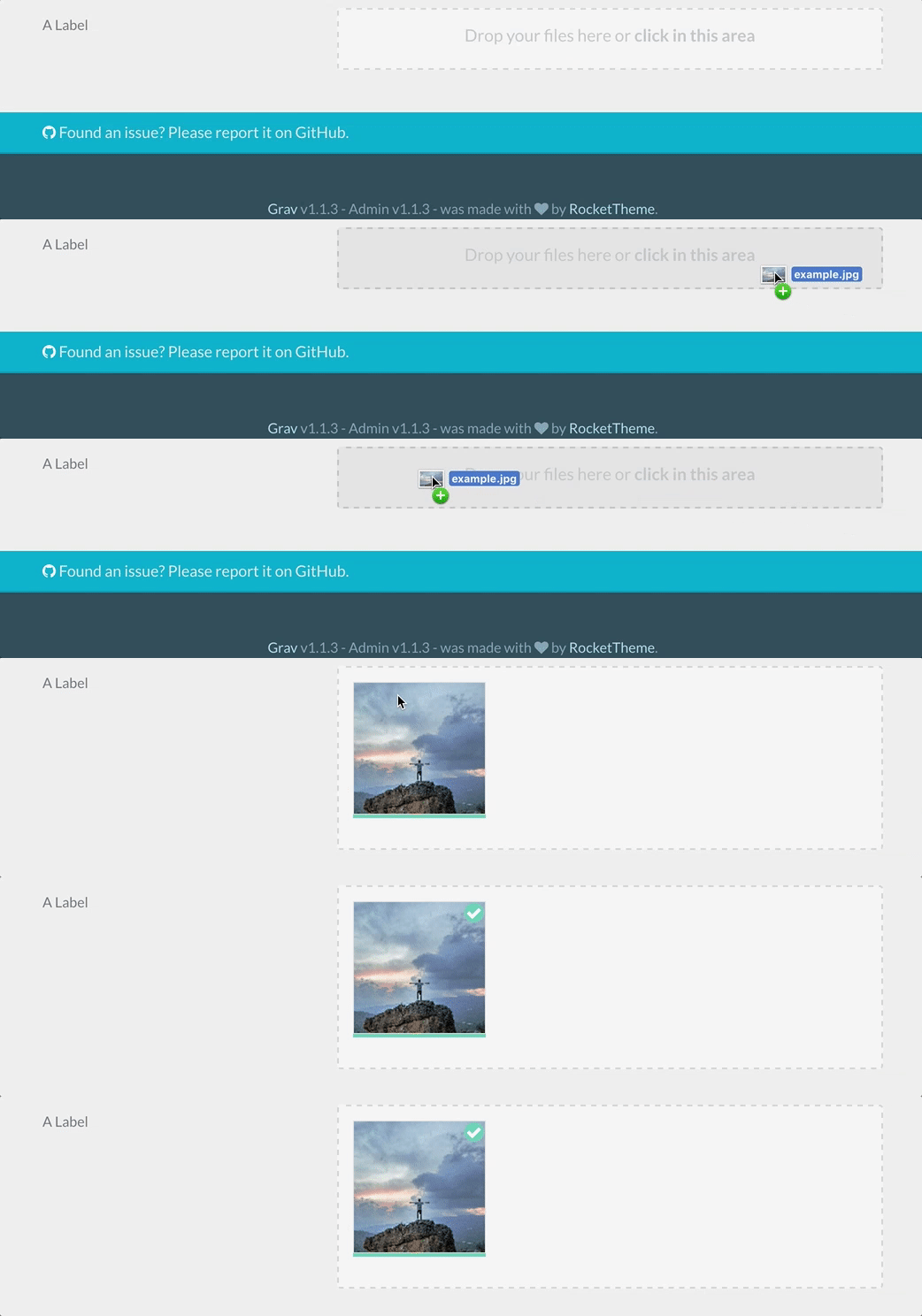
Caution
The file field is intended to be used by configuration, theme, and plugins blueprints, NOT page blueprints. For pages, you should use the existing pagemedia field and then utilize the filepicker field to select the files.
Caution
The file field does not currently work as expected in a list field. Use a single pagemedia field separate from the list with one or more filepicker fields in the list.
Warning
More details can be found in the dedicated How To: Add a File Upload section. Also note that displaying an image uploaded in a file field is not done the same way as with a filepicker field. More details about how to access images uploaded in a file field can be found on this cookbook entry.
Example:
 1custom_logo_login_screen:
 2  type: file
 3  label: Custom Logo Login Screen
 4  destination: 'plugins://admin/assets'
 5  accept:
 6    - image/*
 1custom_file:
 2  type: file
 3  label: A Label
 4  destination: 'theme://assets'
 5  multiple: true
 6  limit: 5
 7  filesize: 1
 8  accept:
 9    - image/*
| Attribute | Description |
|---|---|
destination |
The folder where the files will be stored, using a stream or relative to the Grav root. E.g. plugins://my-plugin/assets |
multiple |
Whether or not to allow more than one file per field |
limit |
When multiple is enabled, allows to constrain the amount of files permitted to be uploaded |
filesize |
The size in MB each file is allowed |
accept |
Add a list of accepted page mime types and extensions. E.g. ["image/*", '.mp3'] |
random_name |
Uses a random filename for each file |
avoid_overwriting |
Will append a timestamp before each filename if a conflict would occur |
allow_extensions |
Lets this field upload page content or stylesheets through the Admin2 API, which refuses them by default. Only md, markdown, css, scss, sass and less can be allowed. E.g. [css]. See How to: Add a file upload |
| Common Attributes Allowed |
|---|
| default |
| disabled |
| help |
| label |
| name |
| size |
| style |
| toggleable |
| validate.required |
| validate.type |
Filepicker Field
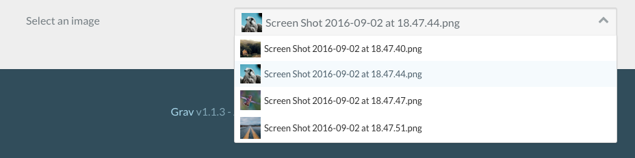
The filepicker field type can be used in pages, plugin and theme configurations (blueprints). Handles selecting a file from a location and saving it to the page headers or theme / plugin configuration.
Note
In Grav 2.0, the Media field does what filepicker does and adds the site media library and external URLs as sources. filepicker still works exactly as documented here and is the field to use when a blueprint also has to render in classic admin.
PageMediaSelect is an alias of this field — same component, same attributes, a name that reads better in page blueprints.
Example:
 1picked_image:
 2  type: filepicker
 3  folder: 'theme://images/pages'
 4  label: Select a file
 5  preview_images: true
 6  accept:
 7    - .png
 8    - .jpg
 1header.a_file:
 2  type: filepicker
 3  folder: 'self@'
 4  preview_images: true
 5  label: Select a file
| Attribute | Description |
|---|---|
folder |
The folder where the files will be looked up, using a stream or relative to the Grav root. Accepts any value in the file field destination format. |
accept |
A list of accepted file extensions |
preview_images |
If enabled, image files will have a little preview |
on_demand |
If enabled, will only load the files and images when the filepicker is focused. This is useful for reducing admin edit page load times when there is large media or many filepicker fields |
| Common Attributes Allowed |
|---|
| default |
| disabled |
| help |
| label |
| name |
| size |
| style |
| toggleable |
| validate.required |
Frontmatter Field

The frontmatter field type shows a plain YAML code editor, with no formatting toolbar. Whatever text is typed into it is stored verbatim, as a raw string (with line breaks represented as escape sequences), under the field's own name — it is not parsed or merged into the page's actual header keys.
Note
Despite the name, this field does not edit the page's real frontmatter and does not turn the text you type into individual header fields. For example, giving it the name frontmatter_field and typing:
 1> show_title: true
 2> title_h1: 'Heading H1'
 3>
results in the page header storing it as a single raw string value:
 1> frontmatter_field: "show_title: true\ntitle_h1: 'Heading H1'"
 2>
This makes it useful for capturing a freeform block of text (for example, a snippet meant to be parsed later in Twig with a YAML filter, or arbitrary configuration notes), rather than for editing a page's own frontmatter directly.
This is a different mechanism from Admin's built-in Expert mode, which edits the page's actual header directly. Expert mode is implemented using the Editor Field with type: editor and classes: frontmatter in blueprints/admin/pages/raw.yaml. It uses YAML codemirror mode and processes content as real header keys — see that section if what you need is a reusable raw-YAML editor whose content maps onto header keys.
Example:
 1header.notes:
 2  type: frontmatter
 3  label: Freeform Notes
 4  help: Anything typed here is stored as a single raw text block
Note
Admin Next / Admin2: The frontmatter field wraps a plain YAML code editor with a maximum height of 600px and overflow scrolling. It accepts label, help, disabled and readonly attributes from the field's configuration. The value is always treated as a plain string, confirming the raw-text storage behavior.
Admin Classic: This field is deprecated since 2016. It is implemented as an alias to the editor field with YAML codemirror mode. For new blueprints, use type: editor instead — it accepts all the same options and is actively maintained. It accepts all attributes that the editor field accepts, including codemirror options.
Raw Header Behavior: When a frontmatter field is used in the same blueprint as a content field, it automatically enables the raw-header editing toggle in the page editor. This behavior is keyed specifically on the field being named frontmatter alongside a content field (see AdminController.php:2930).
Honeypot Field
The honeypot field type creates a hidden field that, when filled out, will return with an error. This is a useful way to prevent bots from filling out and submitting a form.
Example:
 1fields:
 2    - name: honeypot
 3      type: honeypot
This is a simple text field which does not appear on the front end. Bots, which detect fields in the code and fill them out automatically, will likely fill the field out. The error prevents that form from being properly submitted. The error comes back next to the form element, rather than on the top in a message block.
A honeypot field is a popular alternative to captcha fields.
IconPicker Field
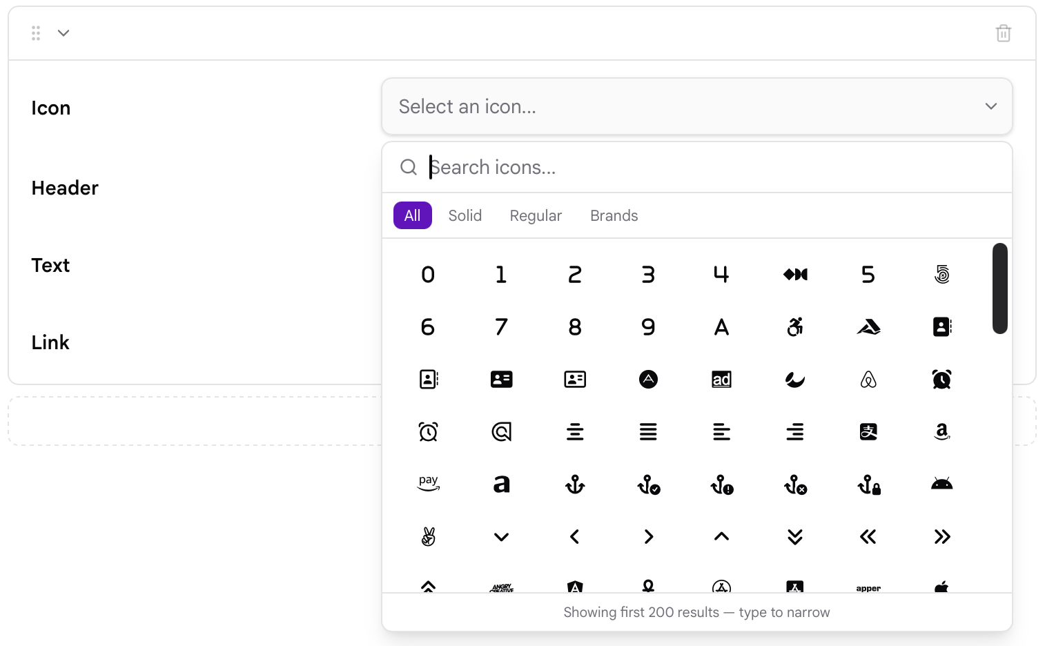
The iconpicker field type provides a visual picker for selecting a Font Awesome icon. The selected icon is stored as a string containing its Font Awesome class name.
The field is available in both the classic Admin and Admin Next. Admin Next provides additional Font Awesome icon families and a searchable picker, while classic Admin uses the Font Awesome icon set bundled with the Admin plugin.
Example:
 1icon:
 2    type: iconpicker
 3    label: Choose an icon
The selected icon can then be used in a template, for example:
 1{% if page.header.icon %} <i class="{{ page.header.icon }}"></i>
 2{% endif %}
In Admin Next, the picker provides separate Solid, Regular, and Brands icon families. Icons can be searched by name or by their associated search terms, and up to 200 matching icons are displayed at a time.
For example, selecting a Solid house icon stores:
fa-house
A Regular or Brands icon includes its family in the stored value:
fa-regular fa-address-book
fa-brands fa-github
This allows the selected value to be used directly as a Font Awesome class in the site's theme.
Format
The classic Admin supports the format attribute:
 1icon:
 2    type: iconpicker
 3    format: short
short stores the short icon class format. Any other value, or an omitted format attribute, uses the long format.
Note
The format attribute is a classic Admin option. Admin Next uses its own Font Awesome value format and does not use this attribute when rendering the picker.
| Attribute | Description |
|---|---|
format |
Controls the icon value format in classic Admin. Set to short to use the short format; when omitted, the long format is used. |
The icon picker is based on Font Awesome. Classic Admin loads its icon definitions from the Font Awesome data bundled with the Admin plugin, while Admin Next maintains its own icon catalogue and supports Solid, Regular and Brands families.
| Common Attributes Allowed |
|---|
| autocomplete |
| autofocus |
| classes |
| default |
| disabled |
| help |
| id |
| label |
| name |
| novalidate |
| placeholder |
| readonly |
| size |
| style |
| toggleable |
| validate.required |
| validate.type |
List Field
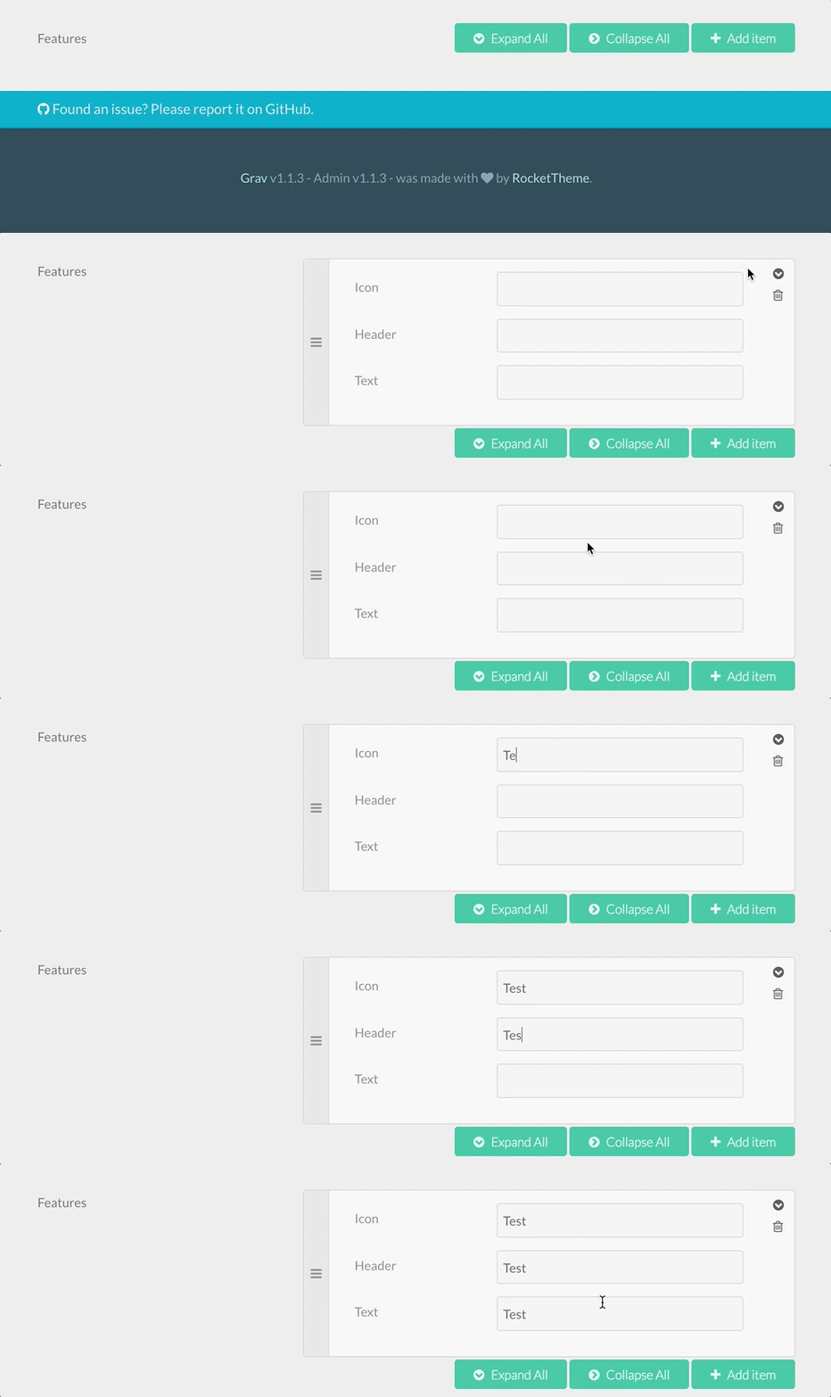
The list field type is used to create collections of fields. The field accepts a fields attribute that will host subfields, and there will be an "Add item" button to allow the user to add more items to the collection.
Example:
 1header.buttons:
 2  name: buttons
 3  type: list
 4  style: vertical
 5  label: Buttons
 6  fields:
 7    .text:
 8      type: text
 9      label: Text
10    .url:
11      type: text
12      label: URL
13    .primary:
14      type: toggle
15      label: Primary
16      highlight: 1
17      default: 1
18      options:
19          1: 'Yes'
20          0: 'No'
21      validate:
22          type: bool
This example will generate this Admin interface:
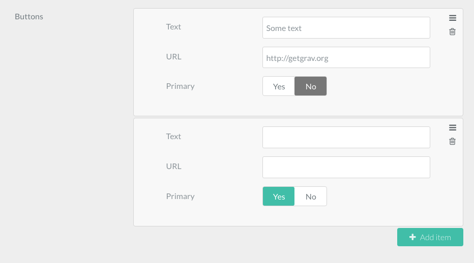
When saving the page, we'll see the following YAML added to the page frontmatter:
 1buttons:
 2    -
 3        text: 'Some text'
 4        url: 'https://getgrav.org'
 5        primary: false
 6    -
 7        text: 'Another text'
 8        url: 'https://another-url.com'
 9        primary: true
This will be used in the Theme Twig to output the list in some nice way.
Another example of this field definition is this list of Features, used by Antimatter's Features Modular child page. Every feature has an icon, a header and some text:
 1header.features:
 2  name: features
 3  type: list
 4  label: Features
 5
 6  fields:
 7    .icon:
 8      type: text
 9      label: Icon
10    .header:
11      type: text
12      label: Header
13    .text:
14      type: text
15      label: Text
Accessing and displaying the data of a list field is done with a simple twig for loop, like in the example below:
 1{% for feature in page.header.features %}
 2    {{ feature.icon }}
 3    {{ feature.header }}
 4    {{ feature.text }}
 5{% endfor %}
| Attribute | Description |
|---|---|
fields |
The subfields |
collapsed |
If true, the list is opened collapsed. By default it's expanded |
style |
Can be set to vertical to conserve horizontal space |
btnLabel |
The "add new item" label text |
sort |
Boolean. If negative, disables the ability to sort items |
controls |
Decides where the "Add Item" button will be placed. Can be set to [top|bottom|both]. Defaults to bottom. |
placement |
Decides where the added item will be placed. Can be set to [top|bottom|position]. Defaults to bottom. If placement value is top or bottom, both buttons add item to top or bottom respectively. If placement value is position, item is added depending on a clicked button position - if top button is clicked, item will be added to top and if bottom button - to bottom. |
min |
Minimum number of items allowed in the list. |
max |
Maximum number of items allowed in the list. 'Add item' button won't function past this number |
| Common Attributes Allowed |
|---|
| default |
| help |
| label |
| name |
| validate.required |
| validate.type |
| size |
Markdown Field
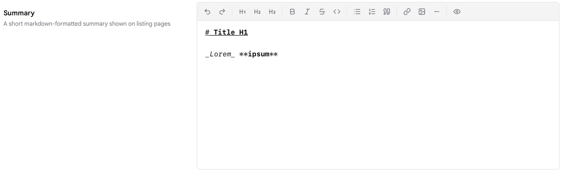
The markdown field type shows the Markdown editor used by the page's Content field: a formatting toolbar, a preview toggle and image insertion. It is the field type system/blueprints/pages/default.yaml uses for content, and you can add it anywhere else in a blueprint to give a page a second Markdown area.
Example:
 1header.summary:
 2  type: markdown
 3  label: Summary
 4  help: A short Markdown summary shown on listing pages
The value is stored as raw Markdown, so run it through the markdown filter when you output it in a template:
1{{ page.header.summary|markdown }}
Note
In Admin Next the toolbar has Undo, Redo, Heading 1 to 3, Bold, Italic, Strikethrough, Inline Code, Bullet List, Ordered List, Blockquote, Link, Image, Horizontal Rule and Preview. Preview swaps the editor for a rendered preview until you click it again. The Image button opens a picker with the page's media, the site media library and a URL option, and you can also drop or paste images straight into the editor. If a user has chosen Editor Pro as their Content Editor, every markdown field is shown with Editor Pro instead. Live collaborative editing applies to the page's main content field only.
Note
In classic Admin, markdown is the Editor Field with its full toolbar switched on (headings H1 to H6 and the Code/Preview toggle), in GitHub Flavored Markdown mode with spellcheck on.
| Attribute | Description |
|---|---|
rows |
Admin Next only. Minimum editor height, as rows × 24px. Defaults to 300px. The editor grows with its content unless the user has set a fixed editor height in their preferences. |
codemirror |
Classic Admin only. Options merged into the CodeMirror editor config (defaults: mode: gfm, spellcheck: true). Admin Next ignores it. |
resizer |
Classic Admin only. Set to false to hide the drag handle that resizes the editor. |
| Common Attributes Allowed |
|---|
| default |
| help |
| label |
| name |
| style |
| validate.required |
| validate.type |
| autofocus |
| classes |
| disabled |
| id |
| novalidate |
| placeholder |
| readonly |
Media Field
Note
The media field is new in Grav 2.0 and renders in Admin Next only. Classic admin has no template for it, so a blueprint using media will show nothing there. Use filepicker if the same blueprint has to work in both admins.
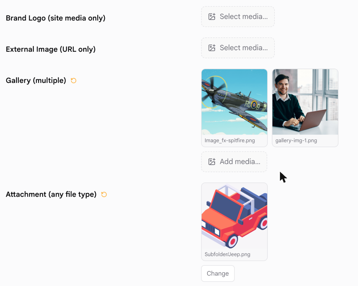
The media field type lets an author pick an image or file from up to three places, in one control:
- Page media — files attached to the page being edited
- Site media — the site-wide media library (the
media://stream, normallyuser/media), browsable by folder - URL — an address typed in by hand
You choose which of those to offer with sources. When only one is enabled the field renders that picker directly, with no tabs.
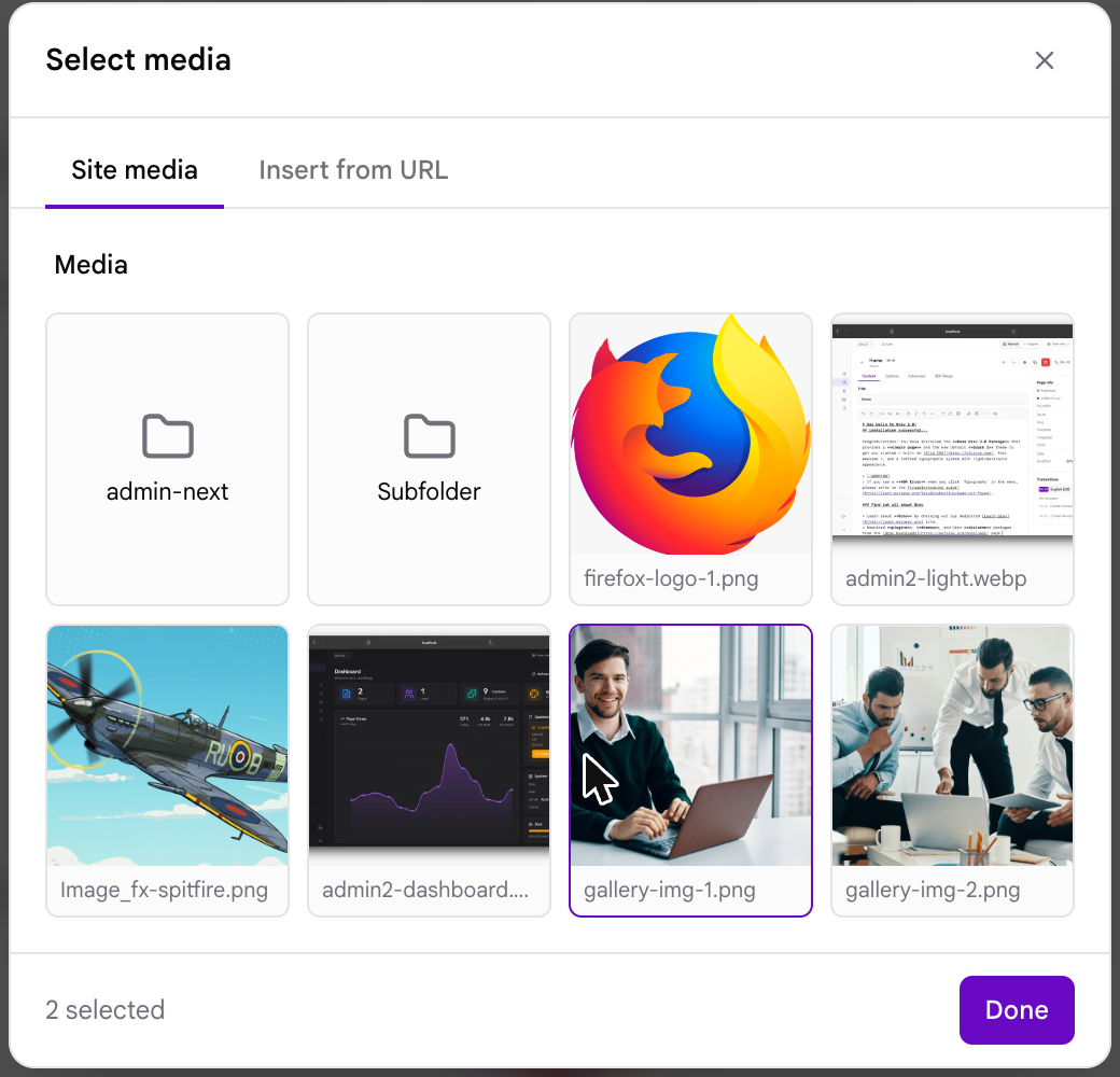
This covers what filepicker does and adds the site library and the URL source. filepicker is unchanged and remains supported, so existing blueprints need no edits.
Example — a hero image the author can take from anywhere:
 1header.hero:
 2  type: media
 3  label: Hero Image
 4  accept:
 5    - image/*
Example — a logo restricted to one folder of the media library:
 1header.logo:
 2  type: media
 3  label: Brand Logo
 4  sources:
 5    - site
 6  folder: 'media://logos'
 7  accept:
 8    - image/*
Example — an ordered gallery, from the library or external URLs:
 1header.gallery:
 2  type: media
 3  label: Gallery
 4  multiple: true
 5  sources:
 6    - site
 7    - url
 8  accept:
 9    - image/*
| Attribute | Description |
|---|---|
sources |
Which pickers to offer, and in what order: page, site, url. Absent or empty means all three. A single entry renders that picker with no tab strip. |
accept |
A list of accepted file types. Takes mime globs (image/*), exact mime types (image/png), and extensions (.pdf) in any combination. Absent means any file type. |
folder |
Roots the site picker at a folder inside the media library, so the author cannot browse above it. Accepts media://logos, user://media/logos or a bare logos. Other streams are not supported here — use filepicker. |
multiple |
Store an ordered list of values instead of a single one. The field then shows each pick as a tile with remove and reorder controls, and the picker stays open so several files can be chosen in a row. |
| Common Attributes Allowed |
|---|
| default |
| help |
| label |
| name |
| placeholder |
| toggleable |
| validate.required |
What Gets Stored
The value is always a plain string, or a list of strings when multiple is set. Which of the three sources it came from is recorded in the value itself:
| Source | Stored value | Example |
|---|---|---|
| Page media | the bare filename | hero.jpg |
| Site media | a media:// stream path |
media://logos/brand.svg |
| URL | the address exactly as entered | https://example.com/hero.jpg |
A page-media value is deliberately the bare filename, which is what filepicker has always stored and what page.media[...] expects, so a field switched from filepicker to media keeps reading its existing values.
With multiple: true the value is a YAML list, in the author's chosen order:
 1gallery:
 2  - 'media://gallery-img-1.png'
 3  - 'media://Subfolder/Jeep.png'
Using the Value in Twig
Each source needs a slightly different treatment. Page media goes through the page's own Media object so you get Grav's image handling; a media:// path is a stream that url() resolves; an external URL is used as it stands.
 1{% set hero = page.header.hero %}
 2
 3{% if hero starts with 'http' %}
 4    <img src="{{ hero }}" alt="">
 5{% elseif hero starts with 'media://' %}
 6    <img src="{{ url(hero) }}" alt="">
 7{% else %}
 8    {{ page.media[hero].cropZoom(1200, 600).html|raw }}
 9{% endif %}
If you restrict a field to one source, the matching branch is all you need. A sources: [site] field, for example, is just <img src="{{ url(page.header.logo) }}">.
Note
url('media://logos/brand.svg') resolves to the file's public path (/user/media/logos/brand.svg in a standard install). If you have locked the user/ folder down so it is not served directly, site-media values will not resolve on the frontend — keep those fields on page media, or serve the files from a location the webserver exposes.
PageMediaSelect Field
The pagemediaselect field type is used to allow the users to choose a media from one of the page media already uploaded through FTP or using the page media manager.
Note
pagemediaselect is an alias of Filepicker, not a separate field. Both admins resolve it to the same component: classic admin's pagemediaselect template is a one-line {% extends %} of the filepicker template, and Admin Next routes both type names to the same field. Every attribute documented under Filepicker therefore works here too, and the two behave identically. The name survives because it reads better in page blueprints, where the intent is specifically "pick one of this page's own media files".
A filepicker with no folder already defaults to the current page's media, so these two declarations are equivalent:
 1header.img_link:
 2  label: Choose media
 3  type: pagemediaselect
 4
 5header.img_link:
 6  label: Choose media
 7  type: filepicker
| Attribute | Description |
|---|---|
multiple |
Select multiple files |
| (others) | See Filepicker — folder, accept, preview_images and on_demand all apply |
| Common Attributes Allowed |
|---|
| default |
| help |
| label |
| name |
| style |
| toggleable |
| validate.required |
| validate.type |
| autofocus |
| classes |
| disabled |
| id |
| novalidate |
| size |
Pages Field

The pages field type shows a list of the site pages.
Example
 1home.alias:
 2    type: pages
 3    size: medium
 4    classes: fancy
 5    label: PLUGIN_ADMIN.HOME_PAGE
 6    start_route: '/some_page'
 7    show_all: false
 8    show_modular: false
 9    show_root: false
10    help: PLUGIN_ADMIN.HOME_PAGE_HELP
| Attribute | Description |
|---|---|
start_route |
Choose a root route for the list |
show_fullpath |
Show page path instead of title |
show_slug |
Show slug |
show_all |
Shows all pages |
show_modular |
Shows modular pages |
show_root |
Shows root page |
options |
An optional list of additional choices |
multiple |
Select multiple pages |
limit_levels |
How many levels to show |
selectize |
If you set multiple to true, you need to add validate.type: array. Otherwise the array of selected pages will not be saved correctly.
| Common Attributes Allowed |
|---|
| default |
| help |
| label |
| name |
| style |
| toggleable |
| validate.required |
| validate.type |
| autofocus |
| classes |
| disabled |
| novalidate |
| size |
Parents Field
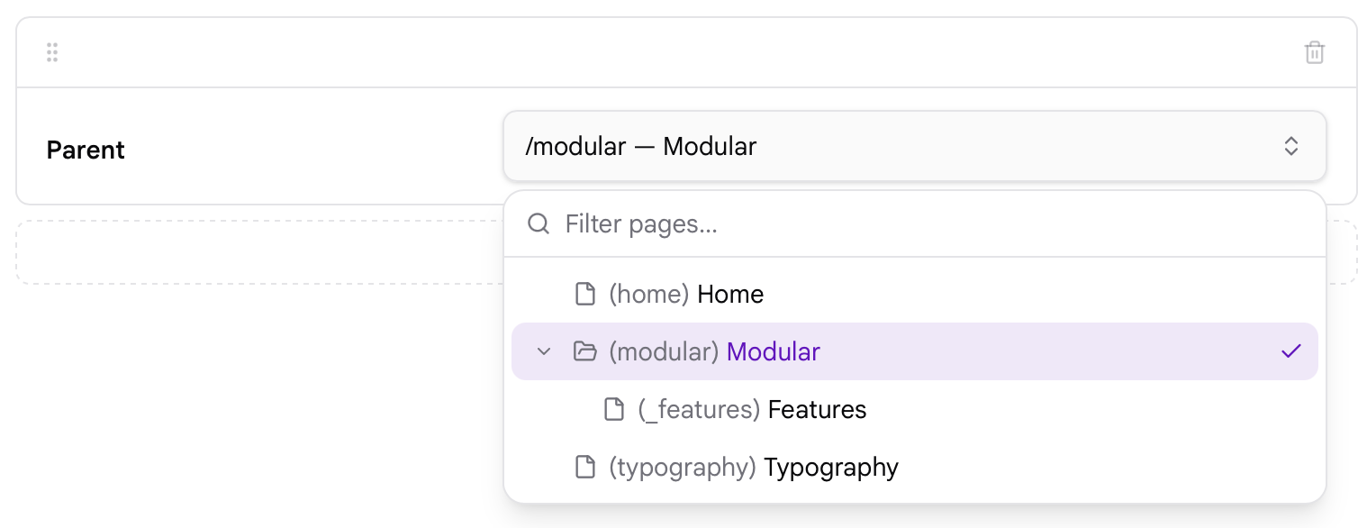
The parents field type provides a page picker for selecting the parent page of a page. It displays the site's page hierarchy and allows a page to be selected as the parent.
The value stored by the field is the selected page's structural route, which is not always the same as its public URL. On a site where the home page is aliased, the home page's public route is / while the value stored here is its real route, so the parent still resolves correctly.
 1parent:
 2    type: parents
 3    label: Parent
In Admin Next (Admin2), the parents field uses the same page picker as the Pages field, but with different default behaviour. The following properties are supported:
 1parent:
 2    type: parents
 3    show_root: true
 4    show_slug: true
 5    show_modular: false
show_root
Controls whether the root of the site (/) can be selected as the parent.
In Admin Next, show_root defaults to true for the parents field. Set it to false to prevent the root from being selected.
 1parent:
 2    type: parents
 3    show_root: false
show_slug
Controls whether the page slug is displayed alongside the page title in the picker.
In Admin Next, show_slug defaults to true.
 1parent:
 2    type: parents
 3    show_slug: false
This only affects how pages are displayed in the picker; it does not change the value stored by the field.
show_modular
Controls whether modular pages can be selected as parents.
In Admin Next, show_modular defaults to false.
 1parent:
 2    type: parents
 3    show_modular: true
Set it to true when modular pages should be included in the page picker.
Note
show_root, show_slug, and show_modular are supported by Admin Next (Admin2). They are not supported by the current classic Admin implementation.
Note
Older Grav examples may show properties such as show_all, show_fullpath, start_route, or limit_levels. These properties are not supported by either current parents field implementation and should not be used.
| Attribute | Description |
|---|---|
show_root |
Admin Next only. Whether the site root (/) can be selected as the parent. Defaults to true for this field type. |
show_slug |
Admin Next only. Whether the page slug is shown beside the title in the picker. Defaults to true. Display only; it does not change the stored value. |
show_modular |
Admin Next only. Whether modular pages can be selected as parents. Defaults to false. |
| Common Attributes Allowed |
|---|
| default |
| help |
| label |
| name |
| size |
| style |
| toggleable |
| validate.required |
| validate.type |
Section Field
The Section field type is used to divide a setting page into sections.
Example:
 1content:
 2    type: section
 3    title: PLUGIN_ADMIN.DEFAULTS
 4    underline: true
 5
 6    fields:
 7
 8        #..... subfields
| Attribute | Description |
|---|---|
title |
A heading title |
underline |
Add an underline after the title |
text |
A text to show beneath |
security |
An array of credentials a user needs to visualize this section |
Selectize Field
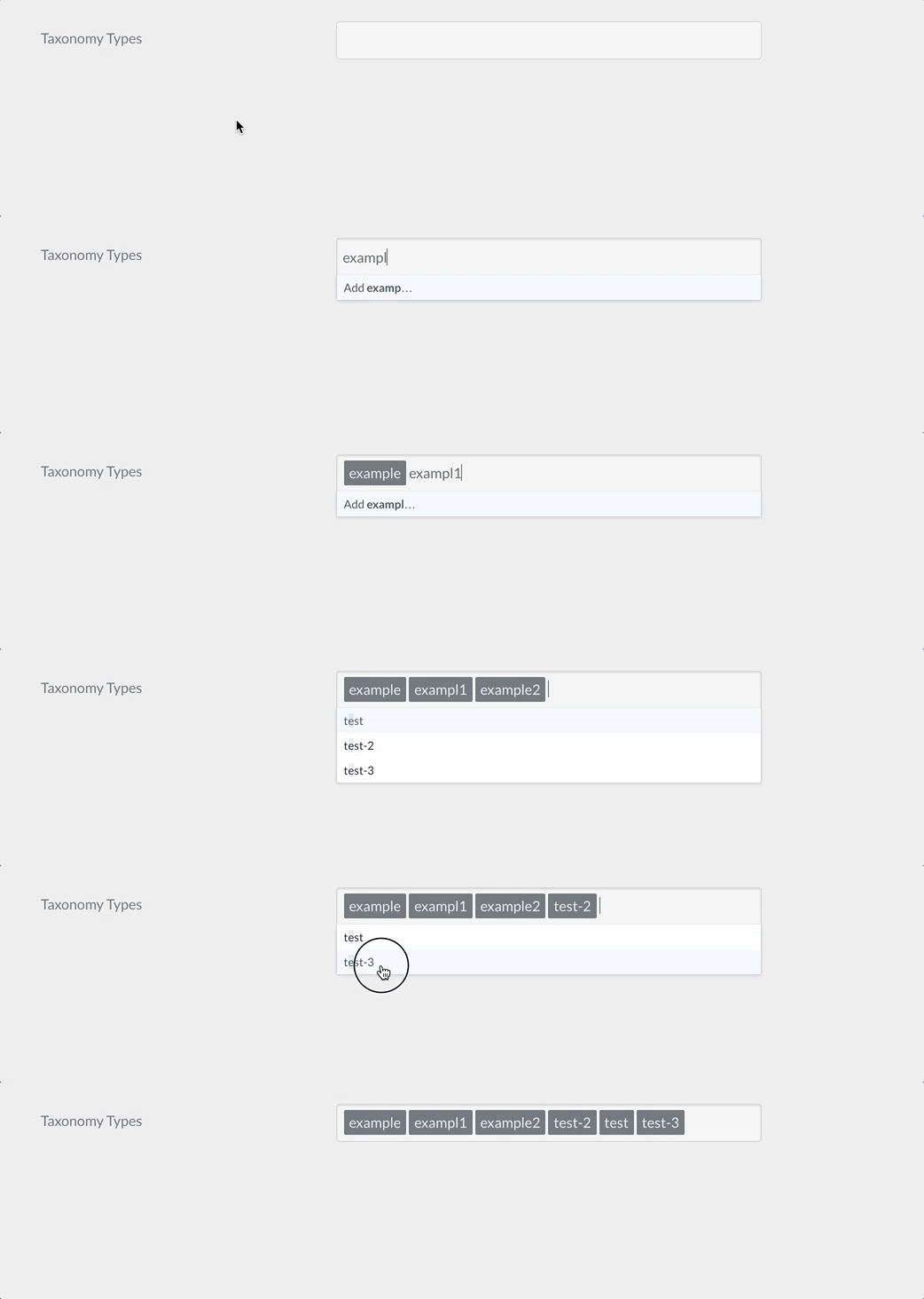
The selectize field type is used to show a hybrid of a text box and a select box. Mostly useful for tagging and other element picking fields.
Example:
 1taxonomies:
 2    type: selectize
 3    selectize:
 4        options:
 5            - text: "test"
 6              value: "real value 1"
 7            - text: "test-2"
 8              value: "real value 2"
 9            - text: "test-3"
10              value: "real value 3"
11    size: large
12    label: PLUGIN_ADMIN.TAXONOMY_TYPES
13    classes: fancy
14    help: PLUGIN_ADMIN.TAXONOMY_TYPES_HELP
15    validate:
16        type: commalist
| Common Attributes Allowed |
|---|
| default |
| help |
| label |
| name |
| style |
| toggleable |
| validate.required |
| validate.type |
| Common Attributes IN INPUT BLOCK |
|---|
| autocomplete |
| autofocus |
| classes |
| disabled |
| id |
| novalidate |
| placeholder |
| readonly |
| size |
| title |
| validate.pattern |
| validate.message |
Taxonomy Field
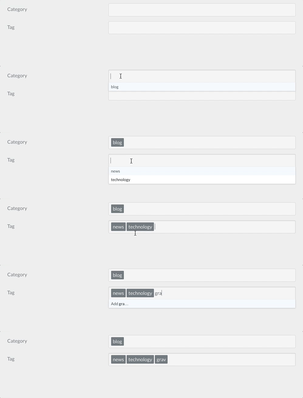
The taxonomy field type is a special select preconfigured to select one or more taxonomy values.
Example:
 1header.taxonomy:
 2  type: taxonomy
 3  label: PLUGIN_ADMIN.TAXONOMY
 4  multiple: true
 5  validate:
 6    type: array
| Attribute | Description |
|---|---|
multiple |
boolean. If positive, the field accepts multiple values |
| Common Attributes Allowed |
|---|
| autofocus |
| classes |
| default |
| disabled |
| help |
| id |
| label |
| name |
| novalidate |
| outerclasses |
| size |
| style |
| validate.required |
| validate.pattern |
| validate.message |