Reference: Form Field Index
Common Field Attributes
Every field accepts a list of attributes you can use. Each field could share these common attributes, but particular fields might ignore them. The best way to check which attributes are allowed on a field is to check the field description in this page and see which attributes are mentioned.
This list provides a common ground so there's no need to repeat the description of a common field.
| Attribute | Description |
|---|---|
autocomplete |
Accepts on or off |
autofocus |
if enabled, autofocus on that field |
classes |
accepts a string with one or more CSS classes to add |
default |
sets the field default value |
disabled |
sets the field disabled state |
help |
Adds a tooltip to the field |
id |
sets the field id. Also sets the for attribute on the label |
label |
sets the field label |
display_label |
Accepts true or false |
labelclasses |
accepts a string with one or more CSS classes to add |
sublabel |
sets the field sublabel |
sublabelclasses |
accepts a string with one or more CSS classes to add |
name |
sets the field name |
novalidate |
sets the field novalidate state |
outerclasses |
Classes added to the div that includes the label and the field |
wrapper_classes |
Classes added to the wrapper that includes the description and the field |
placeholder |
sets the field placeholder value |
readonly |
sets the field readonly state |
size |
sets the field size, which in turn adds a class to its container. Valid values are large, x-small, medium, long, small. You can ofcourse add more in the template you see, when used in the frontend |
style |
sets the field style |
title |
sets the field title value |
type |
sets the field type |
validate.required |
if set to a positive value, sets the field as required. |
validate.pattern |
sets a validation pattern |
validate.message |
sets the message shown if the validation fails |
To add custom attributes, you can use:
attributes:
  key: value
To add custom data-* values, you can use:
datasets:
  key: value
The above shown attributes and datasets definitions lead to the following field definition:
<input name="data[name]" value="" type="text" class="form-input " key="value" data-key="value">NOTE: You can set positive values in multiple ways: 'on', true, 1. Other values are interpreted as negative.
Available Fields
Basic-Captcha Field
Added in Forms 7.0.0 as an local alternative to the Google ReCaptcha field. This field is particularly handy when dealing with SPAM in contact forms when you don't want to deal with the hassle or perhaps GPDR restrictions that come with Google's offering. It uses OCR-resistant fonts to deter attacks, and can be configured with codes to be copied, or simple math questions.

the basic-captcha field type is fully configurable via the forms configuration but comes with sensible defaults. The overall configuration of Basic-Captcha is configured in your global form configuration file (typically user/config/plugins/form.yaml). The default options are:
basic_captcha:
  type: characters            # options: [characters | math]
  chars:
    length: 6                 # number of chars to output
    font: zxx-noise.ttf       # options: [zxx-noise.ttf | zxx-camo.ttf | zxx-xed.ttf | zxx-sans.ttf]
    bg: '#cccccc'             # 6-char hex color
    text: '#333333'           # 6-char hex color
    size: 24                  # font size in px
    start_x: 5                # start position in x direction in px
    start_y: 30               # start position in y direction in px
    box_width: 135            # box width in px
    box_height: 40            # box height in px
  math:
    min: 1                    # smallest digit
    max: 12                   # largest digit
    operators: ['+','-','*']  # operators that can be used in math
Example:
basic-captcha:
    type: basic-captcha
    placeholder: copy the 6 characters
    label: Are you human?
This also requires a matching process: element to ensure the form is validated properly.
This must be the first entry in the process: section of the form to ensure the form is not processed if captcha validation fails.
Example:
process:
    basic-captcha:
        message: Humanity verification failed, please try again...
Turnstile Captcha Field (Cloudflare)
As of Form v7.1.0, Grav adds support for the new Cloudflare Turnstile field. This field is a new way to prevent SPAM in forms, and is a great alternative to the Google ReCaptcha field and GPDR restrictions that come with Google's offering. This field is particularly handy when dealing with SPAM in contact forms. Learn more about Turnstile.
Advantages over Google ReCaptcha
- GDPR compliant and user-privacy focused
- Extremely fast challenge verification
- Very simple to implement both in Cloudflare and Grav, no complex UIs or parameters to configure
- No fancy workarounds for asynchronous form submissions (ajax), it just works!
- Exceptional user experience compared to ReCaptcha, no more counting cars, traffic lights, or other nonsense
- Built on top of machine learning, it will get better over-time and adapt to new attack vectors
- Exhaustive analytics on the effectiveness of the challenge, see screenshot
Integration
Before integrating Grav Forms with Turnstile, you must first create a new Turnstile site, you can also follow the official "get started" tutorial.
Here you can also choose the type of widget you want to use, it can be either managed, non-interactive or invisible. It is important to note that you can only change the type of widget from Cloudflare, you won't be able to configure this via Grav. However, if not happy with one choice, you will be able to change it later if you need to. Learn more about the different widget types.
Make sure you add any Domain you might need to use the Turnstile field on, this might include your local environment.
Once you have created a site, you will be given a site_key and site_secret that you will need to configure in your form configuration file (typically user/config/plugins/form.yaml). You can ignore the script tag suggested, as Grav takes care of it for you.
The default options are:
turnstile:
  theme: light
  site_key: <Your Turnstile Site Key>
  secret_key: <Your Turnstile Secret Key>
Finally, you will also requires a matching process: element to ensure the form is validated properly.
This must be the first entry in the process: section of the form to ensure the form is not processed if captcha validation fails.
Example
A typical example for a contact form would look like the following.
form:
  name: contact
  fields:
    name:
      label: Name
      type: text
      validate:
        required: true
    email:
      label: Email
      type: email
      validate:
        required: true
    message:
      label: Message
      type: textarea
      validate:
        required: true
    captcha:
        type: turnstile
        theme: light
  buttons:
    submit:
      type: submit
      value: Submit
  process:
    turnstile: true
    email:
      subject: "[Acme] {{ form.value.name|e }}"
      reply_to: "{{ form.value.name|e }} <{{ form.value.email }}>"
    message: Thanks for contacting us!
    reset: true
    display: '/'
Google Captcha Field (ReCaptcha)
The captcha field type is used to add a Google reCAPTCHA element to your form. Unlike other elements, it can only be used once in a form.
You should configure your Google reCAPTCHA configurations in the reCAPTCHA Admin Console
As of version 3.0, the field supports 3 variations of reCAPTCHA. The overall configuration of reCAPTCHA is best set in your global form configuration file (typically user/config/plugins/form.yaml). The default options are:
recaptcha:
  version: 2-checkbox
  theme: light
  site_key:
  secret_key:
These options should be set based on the following:
| Key | Values |
|---|---|
| version | Defaults to 2-checkbox, but can also be 2-invisible or 3 |
| theme | Defaults to light, but can also be dark (currently only works for version 2-x versions) |
| site_key | Your Google Site Key |
| secret_key | Your Google Secret Key |
Please ensure the domain of the site is listed in Google's reCAPTCHA configuration
In the form definition, the name attribute of the captcha field must be g-recaptcha-response. The reason is that Google reCAPTCHA stores the Captcha confirmation code in a field named g-recaptcha-response.
Example:
g-recaptcha-response:
  type: captcha
  label: Captcha
You can also provide a custom failure recaptcha_not_validated message, but if you don't the default one is provided by the Form plugin. If you want to set a form-specific recaptcha_site_key rather than setting it globally in the form configuration, you can set that also.
g-recaptcha-response:
  type: captcha
  label: Captcha
  recaptcha_site_key: ENTER_YOUR_CAPTCHA_PUBLIC_KEY
recaptcha_not_validated: 'Captcha not valid!'| Attribute | Description |
|---|---|
recaptcha_site_key |
The Google reCAPTCHA Site Key (optional) |
recaptcha_not_validated |
The message to show if the captcha is not valid |
| Common Attributes Allowed |
|---|
| help |
| label |
| name |
| outerclasses |
| validate.required |
This also requires a matching process: element to ensure the form is validated properly.
This must be the first entry in the process: section of the form to ensure the form is not processed if ReCaptcha validation fails.
Example:
process:
    captcha: true
Server-side Captcha validation
The above code will validate the Captcha in the frontend and prevent form submission if not correct. To also validate the captcha server-side, add the captcha process action to your forms:
process:
    captcha: true
You can also provide an optional success message, but if you don't no specific message will be displayed on success. If you want to set a form-specific recaptcha_secret rather than setting it globally in the form configuration, you can set that also.
process:
    captcha:
      recaptcha_secret: ENTER_YOUR_CAPTCHA_SECRET_KEY
      message: 'Successfully passed reCAPTCHA!'
See the Contact Form example to see it in action.
Checkbox Field
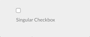
The checkbox field type is used to add a single checkbox to your form.
Example:
agree_to_terms:
  type: checkbox
  label: "Agree to the terms and conditions"
  validate:
required: true| Common Attributes Allowed |
|---|
| autofocus |
| classes |
| default |
| disabled |
| id |
| label |
| name |
| novalidate |
| outerclasses |
| size |
| style |
| validate.required |
| validate.pattern |
| validate.message |
Checkboxes Field

The checkboxes field type is used to add a group of checkboxes to your form.
Examples:
pages.process:
    type: checkboxes
    label: PLUGIN_ADMIN.PROCESS
    help: PLUGIN_ADMIN.PROCESS_HELP
    default:
        markdown: true
        twig: true
    options:
        markdown: Markdown
        twig: Twig
    use: keys
my_field:
type: checkboxes
label: A couple of checkboxes with help for each option and option1 disabled
default:
- option1
- option2
options:
option1: Option 1
option2: Option 2
help_options:
option1: Help for Option 1
option2: Help for Option 2
disabled_options:
- option1| Attribute | Description |
|---|---|
use |
When set to keys, the checkbox will store the value of the element key when the form is submitted. Otherwise, it will use the element value. |
options |
An array of key-value options that will be allowed. |
help_options |
An array of key-value with help for each option defined in options. |
disabled_options |
A list of options that will be displayed disabled. |
| Common Attributes Allowed |
|---|
| autofocus |
| classes |
| default |
| disabled |
| help |
| id |
| label |
| name |
| outerclasses |
| size |
| style |
| validate.required |
| validate.pattern |
| validate.message |
NOTE: The checkboxes field does not support the remember process action.
Conditional Field
The conditional field type is used to conditionally display some other fields base on a condition.
Examples:
If your conditional already returns a true or false then you can simply use this simplified format:
my_conditional:
  type: conditional
  condition: config.plugins.yourplugin.enabled
  fields: # The field(s) below will be displayed only if the plugin named yourplugin is enabled
    header.mytextfield:
      type: text
      label: A text field
However, if you require more complex conditions, you can perform some logic that returns 'true' or 'false' as strings, and the field will understand that too.
my_conditional:
  type: conditional
  condition: "config.site.something == 'custom'"
  fields: # The field(s) below will be displayed only if the `site` configuration option `something` equals `custom`
    header.mytextfield:
        type: text
label: A text field| Attribute | Description |
|---|---|
condition |
The condition evaluated by twig. Any variable accessible by twig can be evaluated |
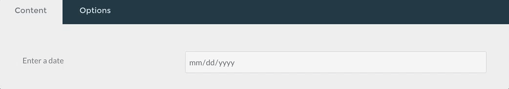
Date Field
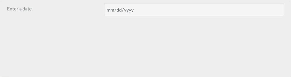
The date field type is used to add an HTML5 date input field.
Example:
-
  type: date
  label: Enter a date
  validate.min: "2014-01-01"
validate.max: "2018-12-31"| Attribute | Description |
|---|---|
validate.min |
Sets the min attribute of the field (see http://html5doctor.com/the-woes-of-date-input/#feature-min-max-attributes) |
validate.max |
Sets the max attribute of the field (see http://html5doctor.com/the-woes-of-date-input/#feature-min-max-attributes) |
| Common Attributes Allowed |
|---|
| autofocus |
| classes |
| default |
| disabled |
| help |
| id |
| label |
| name |
| novalidate |
| outerclasses |
| readonly |
| size |
| style |
| title |
| validate.required |
| validate.pattern |
| validate.message |
Display Field

The display field type is used to show some text or instructions inside the form. Can accept markdown content
Example:
test:
    type: display
    size: large
    label: Instructions
    markdown: true
content: "This is a test of **bold** and _italic_ in a text/display field\n\nanother paragraph...."| Attribute | Description |
|---|---|
markdown |
boolean value that enables markdown processing on the content field |
content |
the textual content to show |
Email Field

The email field type is used to present a text input field that accepts an email, using the email HTML5 input.
Emails are case-insensitive by design. Ensure that your application logic handles upper-, lower- or mixed case emails properly.
Example:
header.email:
  type: email
  autofocus: true
label: Email| Attribute | Description |
|---|---|
minlength |
minimum text length |
maxlength |
maximum text length |
validate.min |
same as minlength |
validate.max |
same as maxlength |
| Common Attributes Allowed |
|---|
| autofocus |
| classes |
| default |
| disabled |
| help |
| id |
| label |
| name |
| novalidate |
| outerclasses |
| readonly |
| size |
| style |
| title |
| validate.required |
| validate.pattern |
| validate.message |
File Field
With the file field type, you can let users upload files through the form. The field by default allows one file only, of type image and will get uploaded to the current page where the form has been declared.
# Default settings
my_files:
  type: file
  multiple: false
  destination: 'self@'
  accept:
- image/*| Attribute | Description |
|---|---|
multiple |
Can be true or false, when set to true, multiple files can be selected at the same time |
destination |
Can be either @self, @page:/route, local/rel/path/, or a PHP stream. Set to @self, the files will be uploaded where the form has been declared (current .md). Using @page:/route will upload to the specified route of a page, if exists (e.g., @page:/blog/a-blog-post). Set to 'local/rel/path': Can be any path relative to the Grav instance. For instance, user/images/uploads. If the path doesn't exist, it will get created, so make sure it is writable.You can also set the value to any valid PHP stream recognized by Grav like user-data://my-form or theme://media/uploads. |
accept |
Takes an array of MIME types that are allowed. For instance to allow only gifs and mp4 files: accept: ['image/gif', 'video/mp4'] |
The File field in the admin is a bit different, allowing also to delete a file uploaded to a form, because the use-case in admin is to upload and then associate a file to a field.
| Common Attributes Allowed |
|---|
| help |
| label |
| name |
| outerclasses |
By default, in Admin the file field will overwrite an uploaded file that has the same name of a newer one, contained in the same folder you want to upload it, unless you set avoid_overwriting to true in the field definition.
Hidden Field
The hidden field type is used to add a hidden element to a form.
Example:
header.some_field:
  type: hidden
default: my-value| Attribute | Description |
|---|---|
name |
The field name. If missing, the field name is got from the field definition element (in the example above: header.some_field) |
| Common Attributes Allowed |
|---|
| default |
Honeypot Field
The honeypot field type creates a hidden field that, when filled out, will return with an error. This is a useful way to prevent bots from filling out and submitting a form.
Example:
fields:
    honeypot:
      type: honeypot
This is a simple text field which does not appear on the front end. Bots, which detect fields in the code and fill them out automatically, will likely fill the field out. The error prevents that form from being properly submitted. The error comes back next to the form element, rather than on the top in a message block.
A honeypot field is a popular alternative to captcha fields.
Ignore Field
The ignore field type can be used to remove unused fields when extending from another blueprint
Example:
header.process:
  type: ignore
content:
  type: ignore
Number Field
The number field type is used to present a text input field that accepts numbers only, using the number HTML5 input.
Example:
header.count:
  type: number
  label: 'How Much?'
  validate:
    min: 10
    max: 360
step: 10| Attribute | Description |
|---|---|
validate.min |
minimum value |
validate.max |
maximum value |
validate.step |
which increments to step up |
| Common Attributes Allowed |
|---|
| autofocus |
| classes |
| default |
| disabled |
| help |
| id |
| label |
| name |
| novalidate |
| outerclasses |
| readonly |
| size |
| style |
| title |
| validate.required |
| validate.pattern |
| validate.message |
Password Field
The password field type is used to present a password text input field.
Example:
password:
  type: password
label: Password| Common Attributes Allowed |
|---|
| autofocus |
| classes |
| default |
| disabled |
| help |
| id |
| label |
| name |
| novalidate |
| outerclasses |
| readonly |
| size |
| style |
| title |
| validate.required |
| validate.pattern |
| validate.message |
Radio Field

The radio field type is used to present a set of radio fields
Example:
my_choice:
  type: radio
  label: Choice
  default: markdown
  options:
      markdown: Markdown
twig: Twig| Attribute | Description |
|---|---|
options |
An array of key-value options that will be allowed. |
| Common Attributes Allowed |
|---|
| default |
| disabled |
| help |
| id |
| label |
| name |
| outerclasses |
| validate.required |
| validate.pattern |
| validate.message |
Range Field
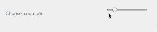
The range field is used to present a range input field.
Example:
header.choose_a_number_in_range:
  type: range
  label: Choose a number
  validate:
    min: 1
max: 10| Common Attributes Allowed |
|---|
| autofocus |
| classes |
| default |
| disabled |
| help |
| id |
| label |
| name |
| novalidate |
| outerclasses |
| readonly |
| size |
| style |
| title |
| validate.required |
| validate.pattern |
| validate.message |
Section Field
The Section field type is used to divide a setting page into sections.
Example:
content:
    type: section
    title: PLUGIN_ADMIN.DEFAULTS
    underline: true

    fields:

#..... subfields| Attribute | Description |
|---|---|
title |
A heading title |
text |
A text to show beneath |
security |
An array of credentials a user needs to visualize this section |
title_level |
Set a custom headline tag. Default: h3 |
Select Field
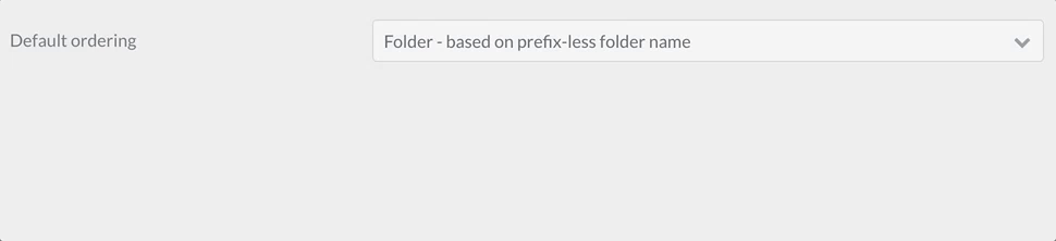
The select field type is used to present a select field.
Example 1:
pages.order.by:
    type: select
    size: long
    classes: fancy
    label: 'Default Ordering'
    help: 'Pages in a list will render using this order unless it is overridden'
    options:
        default: 'Default - based on folder name'
        folder: 'Folder - based on prefix-less folder name'
        title: 'Title - based on title field in header'
        date: 'Date - based on date field in header'
Example 2 - Disabling Individual Options:
my_element:
    type: select
    size: long
    classes: fancy
    label: 'My Select Element'
    help: 'Use the disabled key:value to display but disable a particular option'
    options:
        option1:
          value: 'Option 1'
        option2:
          value: 'Option 2'
        option3:
          disabled: true
value: 'Option 3'| Attribute | Description |
|---|---|
options |
An array of key-value options that will be allowed. The key will be submitted by the form. |
multiple |
Allow the form to accept multiple values. |
If you set multiple to true, you need to add
pages.order.by:
  validate:
    type: array
Otherwise the array of selected values will not be saved correctly.
| Common Attributes Allowed |
|---|
| autofocus |
| classes |
| default |
| disabled |
| help |
| id |
| label |
| name |
| novalidate |
| outerclasses |
| size |
| style |
| validate.required |
| validate.pattern |
| validate.message |
Select Optgroup Field
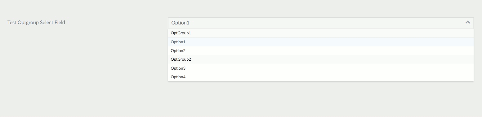
The select_optgroup field type is used to present a select field with groupings.
Example:
header.newField:
    type: select_optgroup
    label: Test Optgroup Select Field
    options:
      - OptGroup1:
        - Option1
        - Option2
      - OptGroup2:
        - Option3
- Option4| Attribute | Description |
|---|---|
options |
An array of key-value options that will be allowed. |
multiple |
Allow the form to accept multiple values. |
| Common Attributes Allowed |
|---|
| autofocus |
| classes |
| default |
| disabled |
| help |
| id |
| label |
| name |
| novalidate |
| outerclasses |
| size |
| style |
| validate.required |
| validate.pattern |
| validate.message |
Spacer Field
The spacer field type is used to add some text, a headline or a hr tag
Example:
test:
    type: spacer
    title: A title
    title_type: h2
    text: Some text
underline: true| Attribute | Description |
|---|---|
title |
add a title to the form |
title_type |
Define the HTML tag for the title (e.g., h1, h2, h3, etc.). Defaults to h3 if not specified. |
text |
Add some text. If title is set, add it after the title |
underline |
boolean, add a <hr> tag if positive |
Tabs / Tab Fields
The tabs and tab field types are used to divide the contained form fields in tabs.
Example:
tabs:
  type: tabs
  active: 1

  fields:
    content:
      type: tab
      title: PLUGIN_ADMIN.CONTENT

      fields:

        # .... other subfields

    options:
      type: tab
      title: PLUGIN_ADMIN.OPTIONS

      fields:

# .... other subfields| Attribute | Description |
|---|---|
active |
The active tab number |
Tel Field
The tel field type is used to present a text input field that accepts a number, using the tel HTML5 input.
Example:
header.phone:
  type: tel
label: 'Your Phone Number'| Attribute | Description |
|---|---|
minlength |
minimum text length |
maxlength |
maximum text length |
validate.min |
same as minlength |
validate.max |
same as maxlength |
| Common Attributes Allowed |
|---|
| autofocus |
| classes |
| default |
| disabled |
| help |
| id |
| label |
| name |
| novalidate |
| outerclasses |
| readonly |
| size |
| style |
| title |
| validate.required |
| validate.pattern |
| validate.message |
Text Field
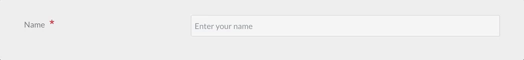
The text field is used to present a text input field.
Example:
header.title:
  type: text
  autofocus: true
  label: PLUGIN_ADMIN.TITLE
  minlength: 10
maxlength: 255| Attribute | Description |
|---|---|
prepend |
prepend some text or HTML to the front of a field |
append |
append some text or HTML to the end of a field |
minlength |
minimum text length |
maxlength |
maximum text length |
validate.min |
same as minlength |
validate.max |
same as maxlength |
| Common Attributes Allowed |
|---|
| autofocus |
| classes |
| default |
| disabled |
| help |
| id |
| label |
| name |
| novalidate |
| outerclasses |
| readonly |
| size |
| style |
| title |
| validate.required |
| validate.pattern |
| validate.message |
Textarea Field
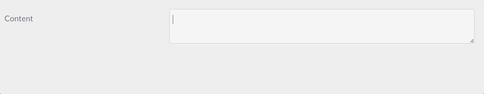
The textarea field is used to present a textarea input field.
Example:
header.content:
  type: textarea
  autofocus: true
  label: PLUGIN_ADMIN.CONTENT
  minlength: 10
maxlength: 255| Attribute | Description |
|---|---|
rows |
Add a rows attribute with the value associated with this property |
cols |
Add a cols attribute with the value associated with this property |
minlength |
minimum text length |
maxlength |
maximum text length |
validate.min |
same as minlength |
validate.max |
same as maxlength |
| Common Attributes Allowed |
|---|
| autofocus |
| classes |
| default |
| disabled |
| help |
| id |
| label |
| name |
| novalidate |
| outerclasses |
| readonly |
| size |
| style |
| title |
| validate.required |
| validate.pattern |
| validate.message |
Toggle Field
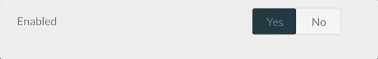
The toggle field type is an on/off kind of input, with configurable labels.
Example:
summary.enabled:
    type: toggle
    label: PLUGIN_ADMIN.ENABLED
    highlight: 1
    help: PLUGIN_ADMIN.ENABLED_HELP
    options:
        1: PLUGIN_ADMIN.YES
        0: PLUGIN_ADMIN.NO
    validate:
type: bool| Attribute | Description |
|---|---|
highlight |
The key of the option to highlight (set green when selected) |
options |
The list of key-value options |
| Common Attributes Allowed |
|---|
| default |
| help |
| label |
| name |
| style |
| toggleable |
| validate.required |
| validate.type |
| disabled |
Url Field
The url field type is used to present a text input field that accepts an URL, using the url HTML5 input.
Example:
header.url:
  type: url
label: 'Your Website Url'| Attribute | Description |
|---|---|
minlength |
minimum text length |
maxlength |
maximum text length |
validate.min |
same as minlength |
validate.max |
same as maxlength |
| Common Attributes Allowed |
|---|
| autofocus |
| classes |
| default |
| disabled |
| help |
| id |
| label |
| name |
| novalidate |
| outerclasses |
| readonly |
| size |
| style |
| title |
| validate.required |
| validate.pattern |
| validate.message |
Currently Undocumented Fields
| Field | Description |
|---|---|
| Array | |
| Avatar | |
| Color | |
| Columns | |
| Column | |
| Datetime | |
| Fieldset | |
| Formname | |
| Key | |
| Month | |
| Signature | |
| Switch | |
| Time | |
| Unique Id | |
| Value | |
| Week |
Found errors? Think you can improve this documentation? Simply click the Edit link at the top of the page, and then the icon on Github to make your changes.